
Work
About
Contact
Case Study
Disney x Fossil
Capturing magic in a box
The Fossil Mickey and Minnie Mouse jewelry collection needed a packaging solution that blended Fossil’s luxury with the joy and nostalgia of Disney’s most iconic characters. The design strategy was built on creating two distinct and collectible unboxing experiences, one for Mickey and one for Minnie, that highlighted the specialness of the jewelry within. This approach transformed the package from simple container into a treasured keepsake.
Design
Cora Woodward
Creative Direction
Sara Stanley
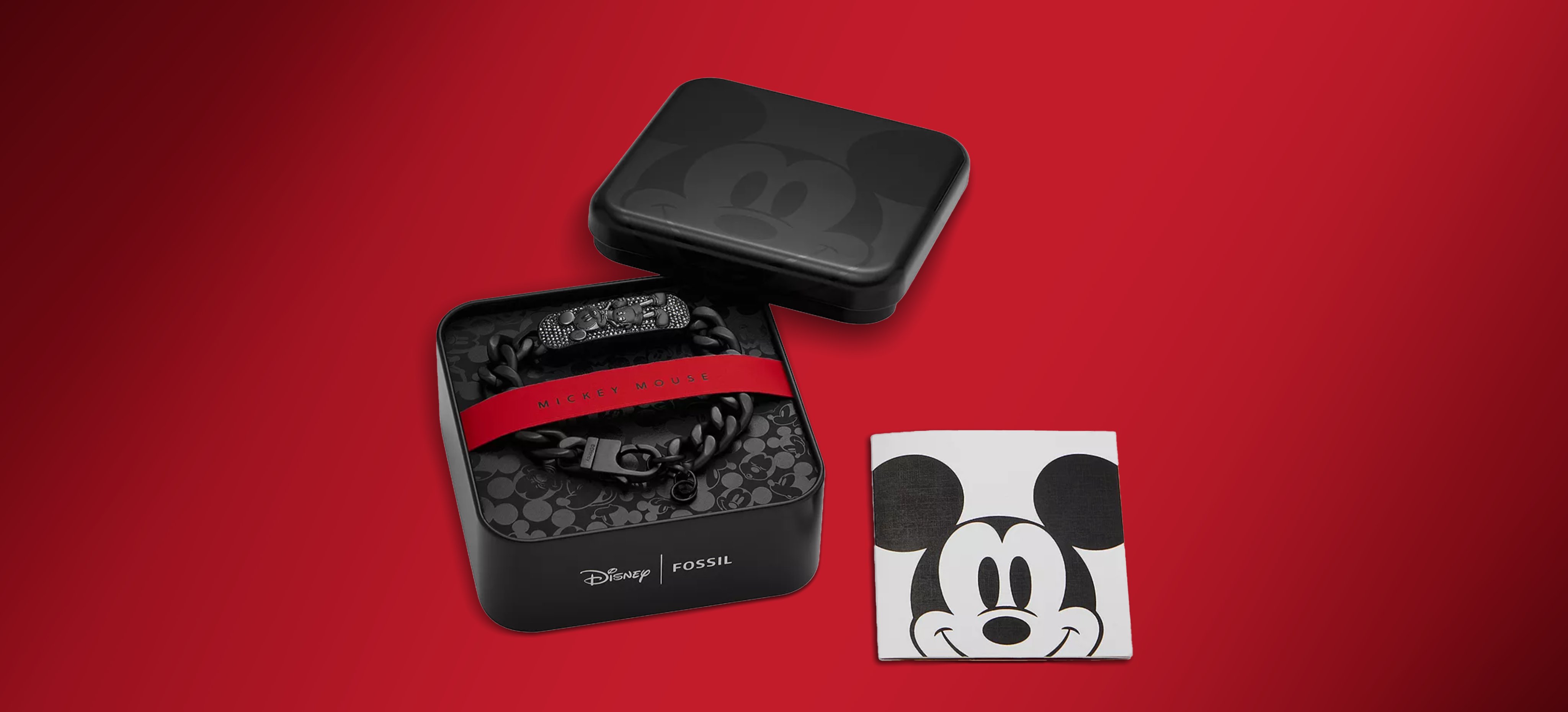
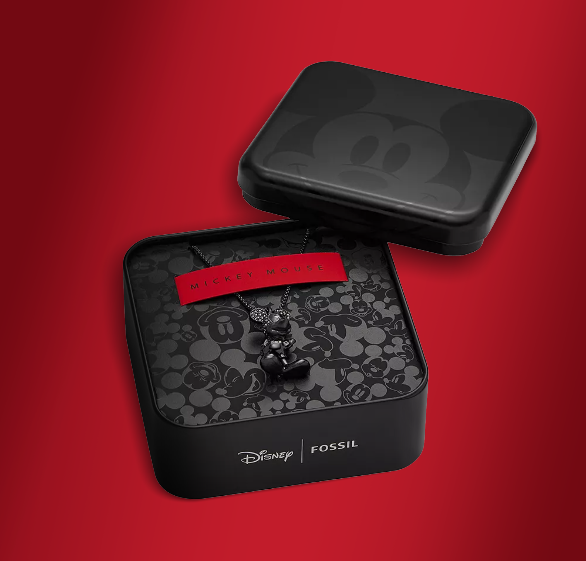
Mickey Jewelry Tins
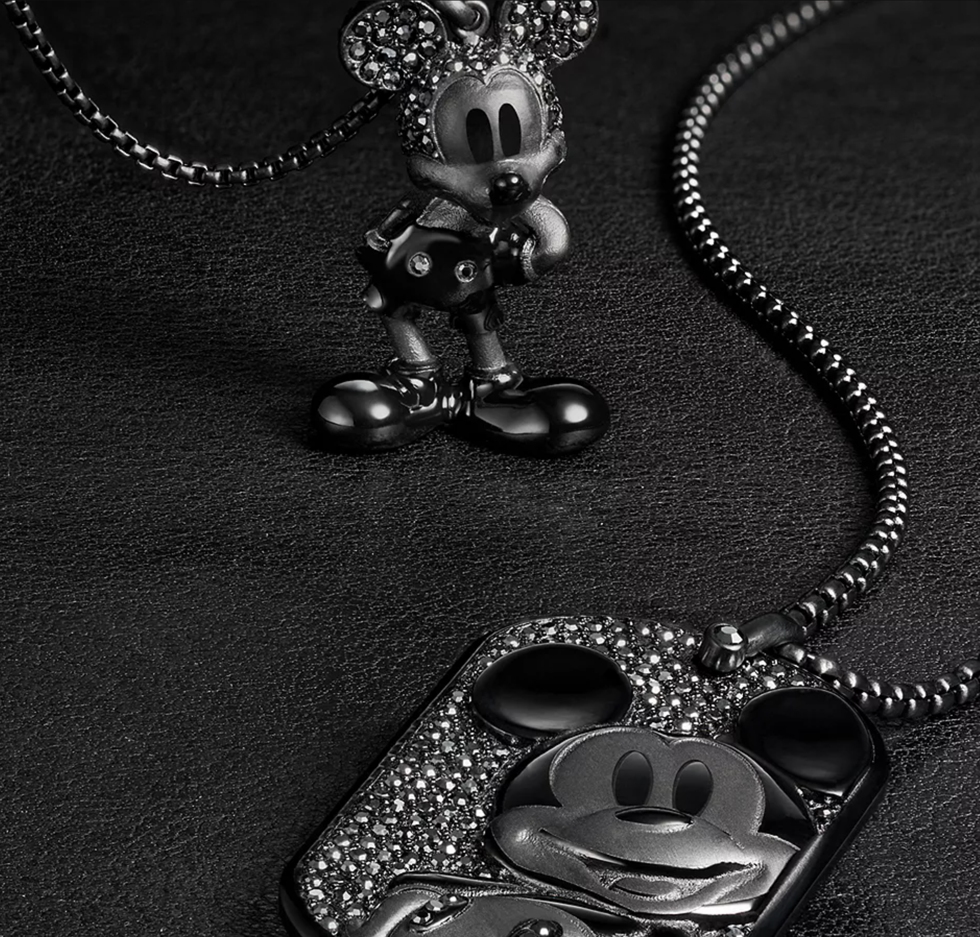
The Mickey Mouse collection embodies a bold, sophisticated luxury built on subtle textural contrast. The exterior of the square tin features a large, striking impression of Mickey’s face using tonal printing, creating a sophisticated, low-key visual impact that is classic and refined. Opening the tin reveals a playful pattern of various Mickey expressions. The jewelry is secured with a red suede paper insert. The bold red is a nod to Mickey’s iconic clothing color and contrasts the dark metal jewelry.
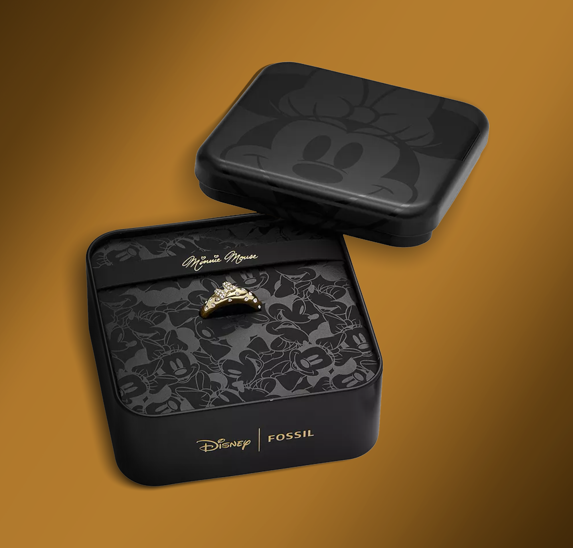
Minnie Jewelry Tins
The Minnie packaging delivers an experience of feminine elegance and classic whimsy. Minnie’s face is tonally printed on the exterior tin. Minnie's expressions are a whimsical tonal pattern lining the tin. Minnie Mouse’s signature decorates the insertelegant, curling capital 'M's and hearts dotting the 'i's introduce a playful, opulent elementThe jewelry is secured with a black insert featuring a gold foil-printed signature of . The contrast of the deep black packaging and the gold accents creates a classic, expensive presentation, appealing directly to the nostalgic, graceful charm of Minnie Mouse.
Conclusion
This packaging duo successfully evoked a sense of nostalgia and quality. By showcasing Mickey's bold red vs. Minnie's elegant gold, each piece of packaging became a reflection of the character it contained. This differentiation created a feeling of personal connection, increasing the collectibility of the jewelry. The rich materials and distinct visuals ensured opening the tin was a moment of magic, transforming a standard purchase into a memorable, whimsical, and luxurious experience designed to reignite the awe and wonder of the inner child in every adult.

Other Projects


Case Study
Disney x Fossil
Capturing magic in a box
The Fossil Mickey and Minnie Mouse jewelry collection needed a packaging solution that blended Fossil’s luxury with the joy and nostalgia of Disney’s most iconic characters. The design strategy was built on creating two distinct and collectible unboxing experiences, one for Mickey and one for Minnie, that highlighted the specialness of the jewelry within. This approach transformed the package from simple container into a treasured keepsake.
Design
Cora Woodward
Creative Direction
Sara Stanley
Mickey Jewelry Tins
The Mickey Mouse collection embodies a bold, sophisticated luxury built on subtle textural contrast. The exterior of the square tin features a large, striking impression of Mickey’s face using tonal printing, creating a sophisticated, low-key visual impact that is classic and refined. Opening the tin reveals a playful pattern of various Mickey expressions. The jewelry is secured with a red suede paper insert. The bold red is a nod to Mickey’s iconic clothing color and contrasts the dark metal jewelry.
Minnie Jewelry Tins
The Minnie packaging delivers an experience of feminine elegance and classic whimsy. Minnie’s face is tonally printed on the exterior tin. Minnie's expressions are a whimsical tonal pattern lining the tin. Minnie Mouse’s signature decorates the insertelegant, curling capital 'M's and hearts dotting the 'i's introduce a playful, opulent elementThe jewelry is secured with a black insert featuring a gold foil-printed signature of . The contrast of the deep black packaging and the gold accents creates a classic, expensive presentation, appealing directly to the nostalgic, graceful charm of Minnie Mouse.
Conclusion
This packaging duo successfully evoked a sense of nostalgia and quality. By showcasing Mickey's bold red vs. Minnie's elegant gold, each piece of packaging became a reflection of the character it contained. This differentiation created a feeling of personal connection, increasing the collectibility of the jewelry. The rich materials and distinct visuals ensured opening the tin was a moment of magic, transforming a standard purchase into a memorable, whimsical, and luxurious experience designed to reignite the awe and wonder of the inner child in every adult.

Other Projects

Case Study
Disney x Fossil
Capturing magic in a box
The Fossil Mickey and Minnie Mouse jewelry collection needed a packaging solution that blended Fossil’s luxury with the joy and nostalgia of Disney’s most iconic characters. The design strategy was built on creating two distinct and collectible unboxing experiences, one for Mickey and one for Minnie, that highlighted the specialness of the jewelry within. This approach transformed the package from simple container into a treasured keepsake.
Design
Cora Woodward
Creative Direction
Sara Stanley
Mickey Jewelry Tins
The Mickey Mouse collection embodies a bold, sophisticated luxury built on subtle textural contrast. The exterior of the square tin features a large, striking impression of Mickey’s face using tonal printing, creating a sophisticated, low-key visual impact that is classic and refined. Opening the tin reveals a playful pattern of various Mickey expressions. The jewelry is secured with a red suede paper insert. The bold red is a nod to Mickey’s iconic clothing color and contrasts the dark metal jewelry.
Minnie Jewelry Tins
The Minnie packaging delivers an experience of feminine elegance and classic whimsy. Minnie’s face is tonally printed on the exterior tin. Minnie's expressions are a whimsical tonal pattern lining the tin. Minnie Mouse’s signature with curling capital 'M's and hearts dotting the 'i's introduce a playful, opulent element, printed in gold foil on the insert. The contrast between the black packaging and the jewelry creates a classic and expensive presentation, appealing to the nostalgic charm of Minnie Mouse.
Conclusion
This packaging duo successfully evoked a sense of nostalgia and quality. By showcasing Mickey's bold red vs. Minnie's elegant gold, each piece of packaging became a reflection of the character it contained. This differentiation created a feeling of personal connection, increasing the collectibility of the jewelry. Opening the tin is a moment of magic, transforming a the purchase into a memorable experience that reignites the awe and wonder of the inner child in every adult.

Other Projects