
Work
About
Contact
Case Study
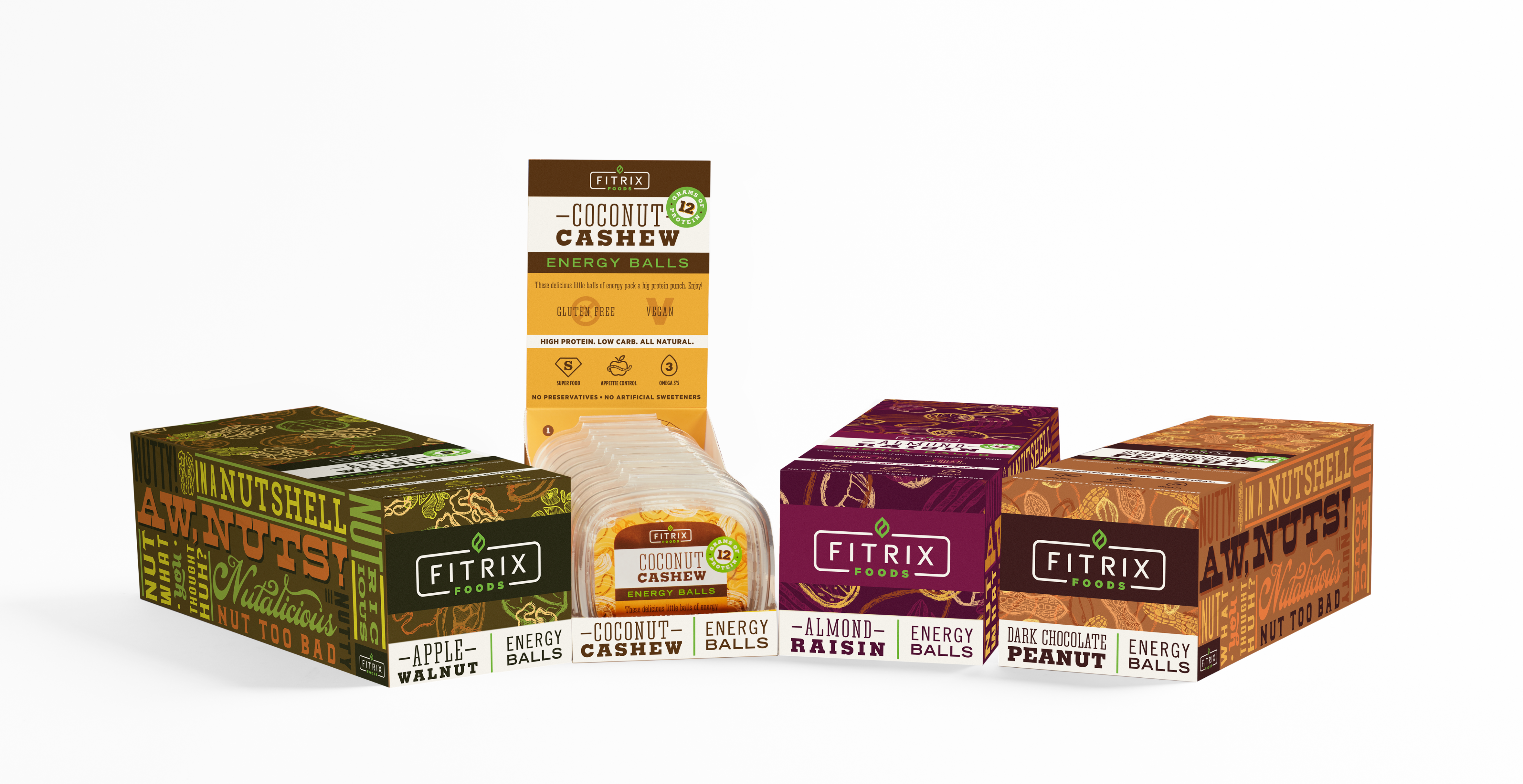
Fitrix Energy Balls
Getting nutty about nutrition
Fitrix energy balls debuted as a truly delicious and nutritious snack with short list of ingredients, challenging their bland tasting, sporty energy-bar competition. The challenge was two-fold: design packaging that stands out as all-natural, high-quality, and delicious while respecting the start-up's initial tight budget. I designed a label for budget-friendly clamshells with rich, natural textures and a down-to-earth sense of humor to create a highly approachable and energetic brand.
Design
Cora Woodward
Creative Direction
Cesar Sanchez
Visual Identity: Humor & Natural Texture
The brand personality is down to earth, fun, and built around the simple, powerful concept: nuts are nature's perfect energy source. To differentiate Fitrix from sterile, high-performance competitors, we created a dynamic, natural, and flavorful look.
Photography
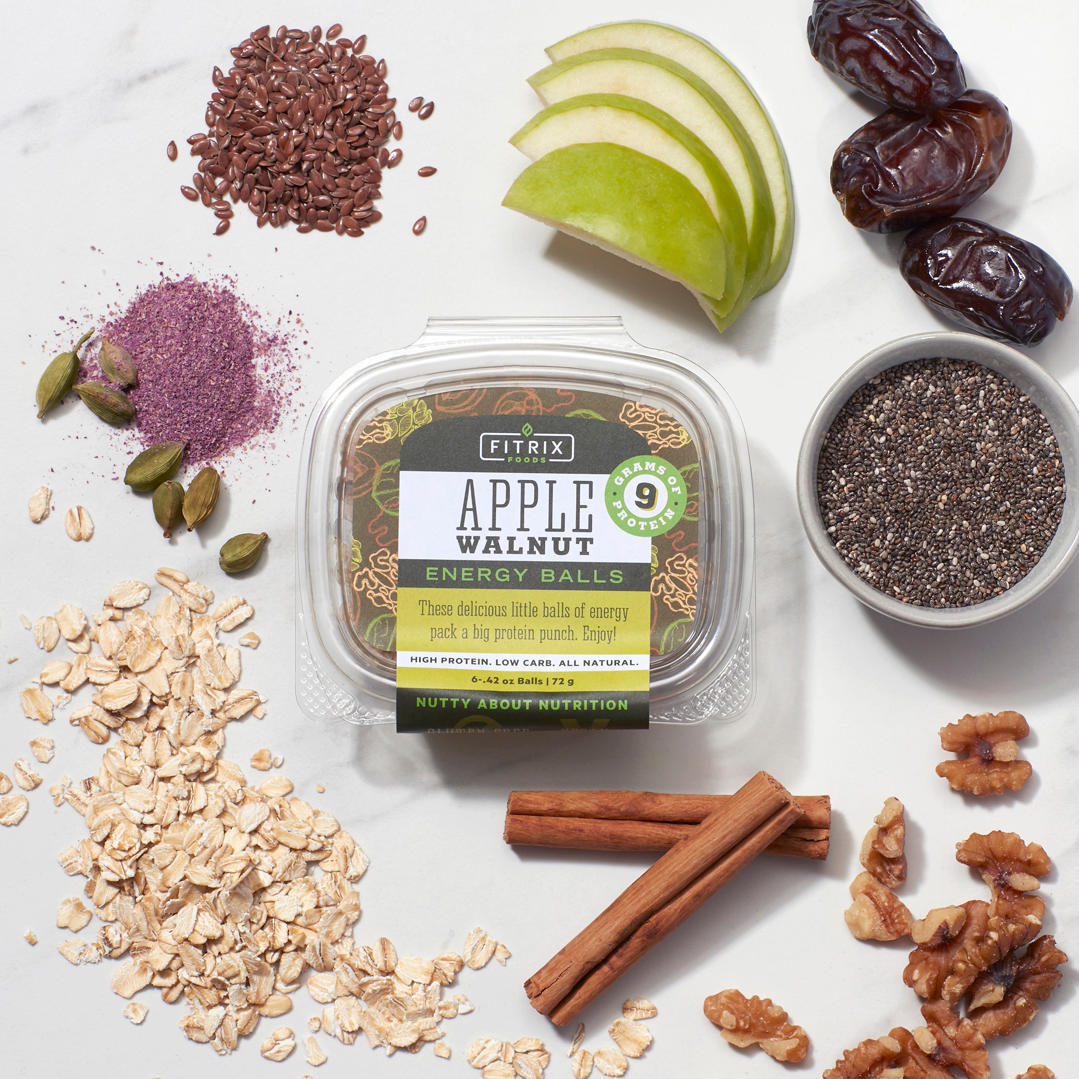
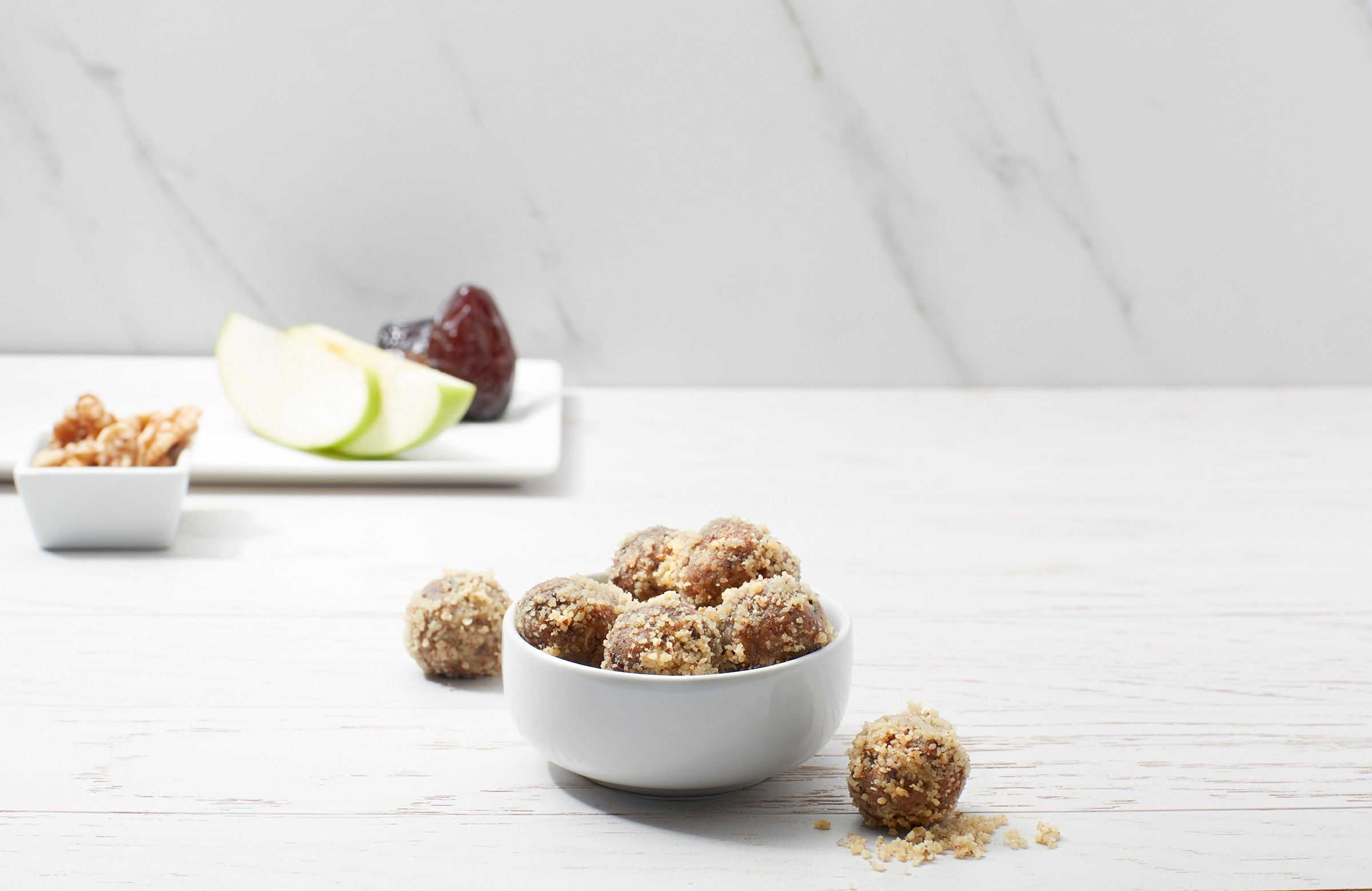
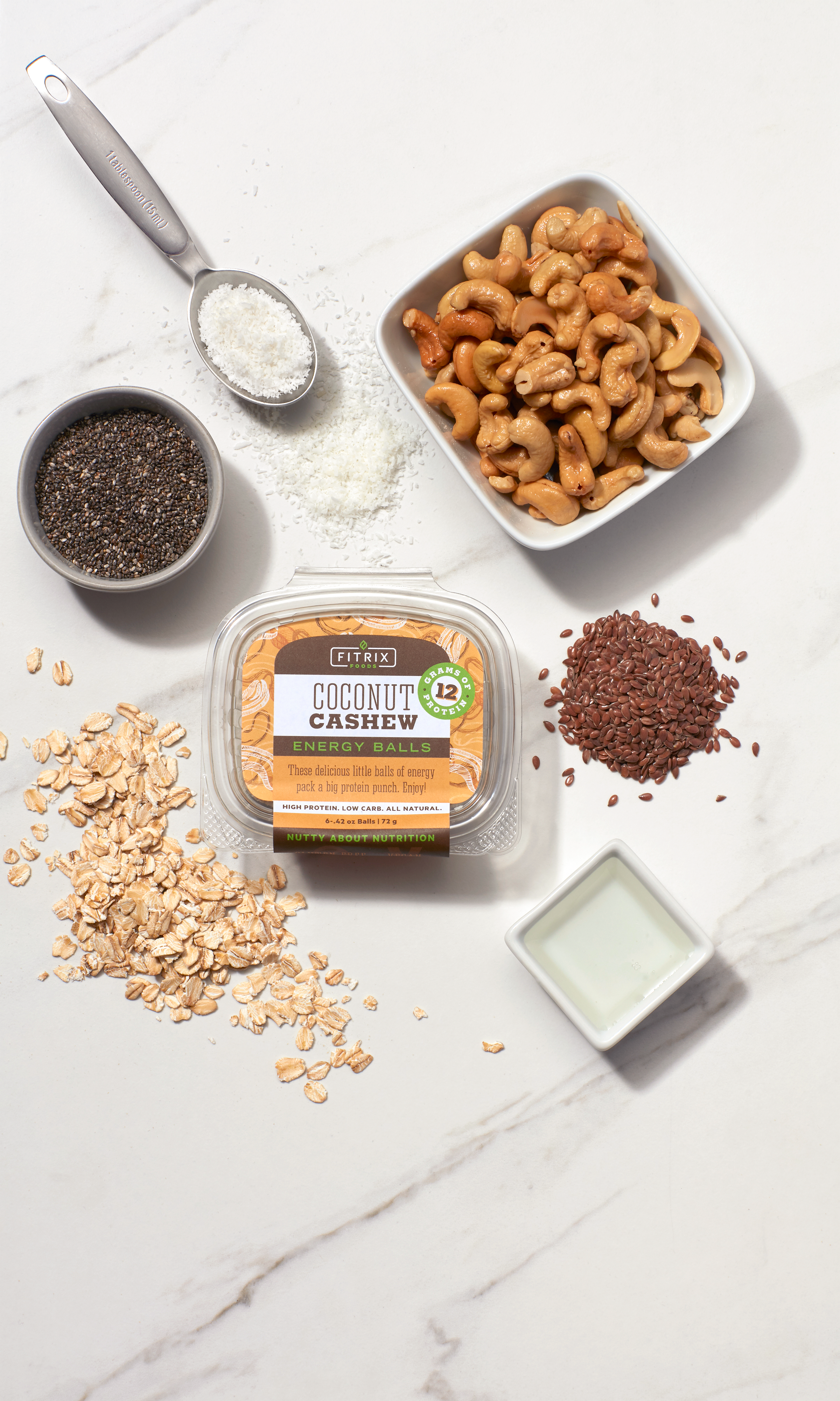
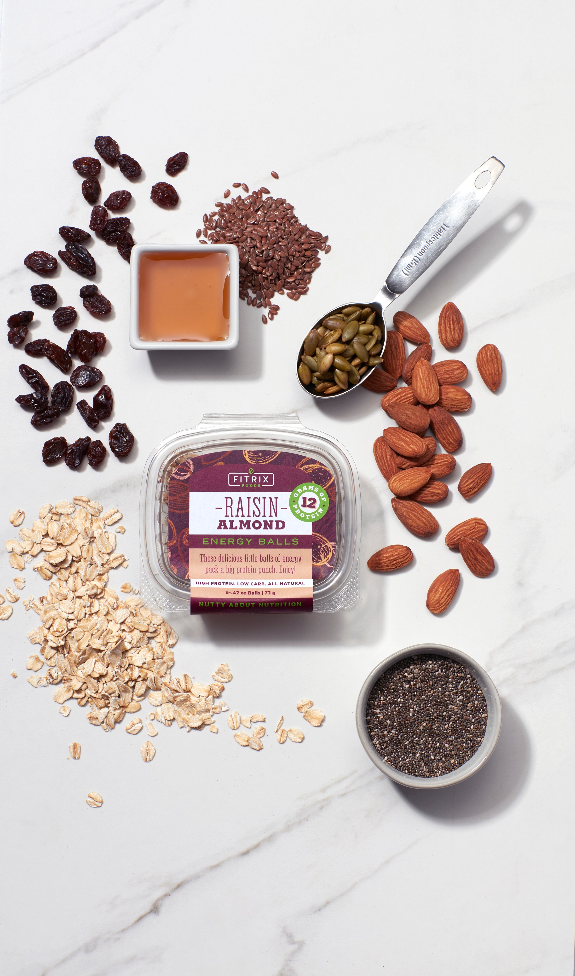
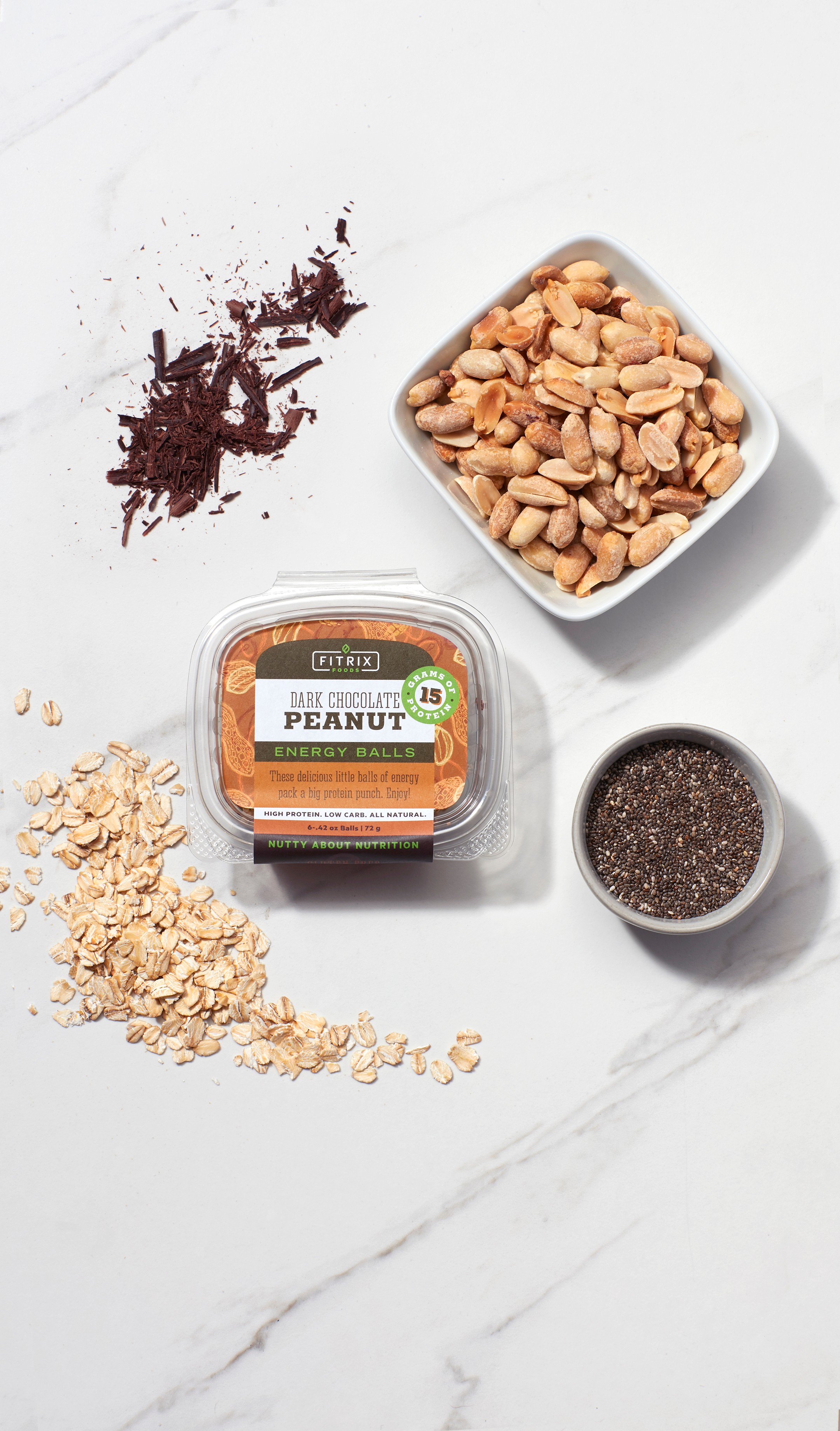
Product photography was carefully executed to showcase the whole, identifiable, high-quality ingredients for each specific flavor, reinforcing the product's premium, natural positioning.
Color
Each flavor is differentiated using a vibrant color scheme pulled directly from its rich ingredients Overlapping color elements were used to create a kinetic, energetic feel that pops on the shelf.
Hand-Drawn Patterns
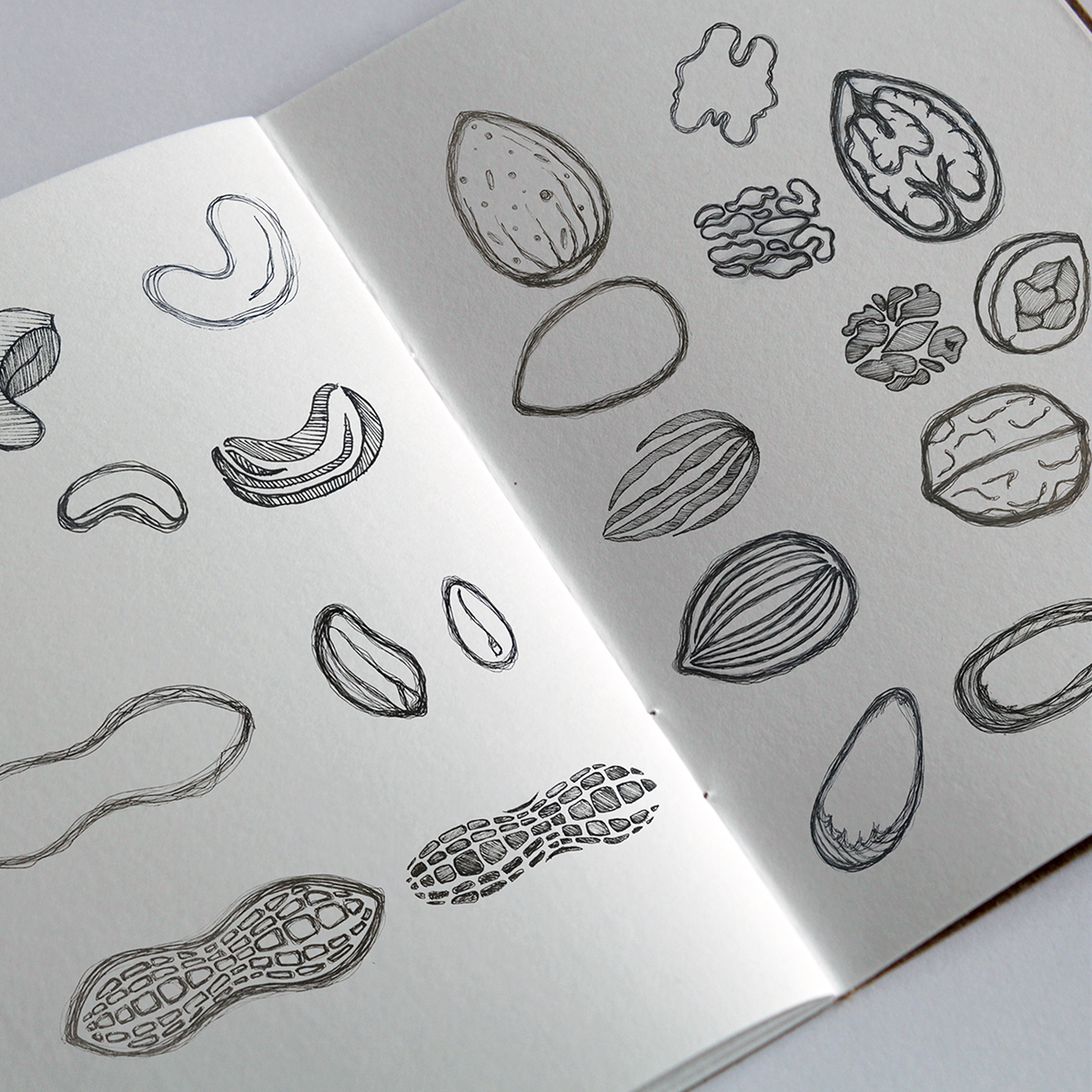
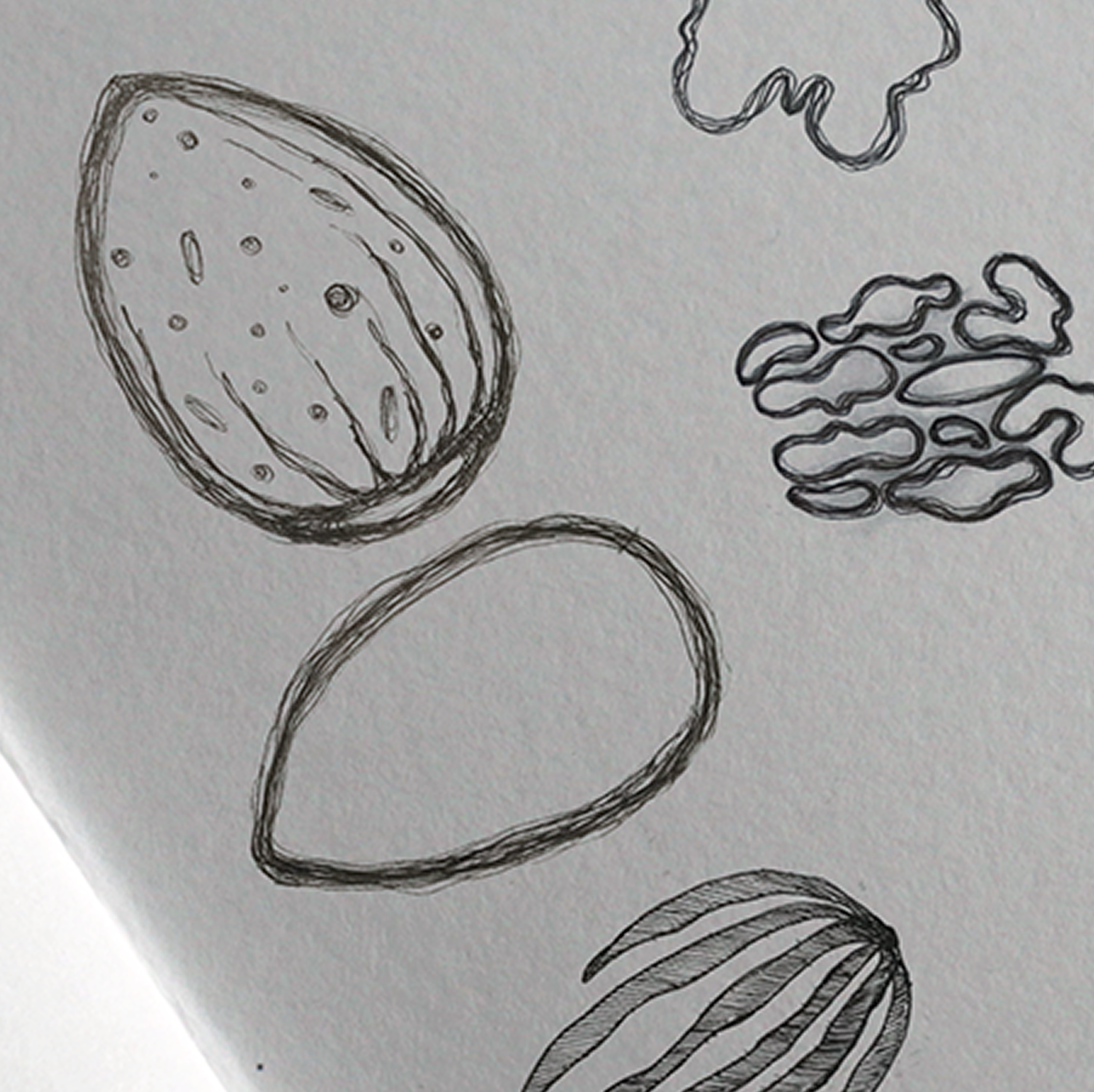
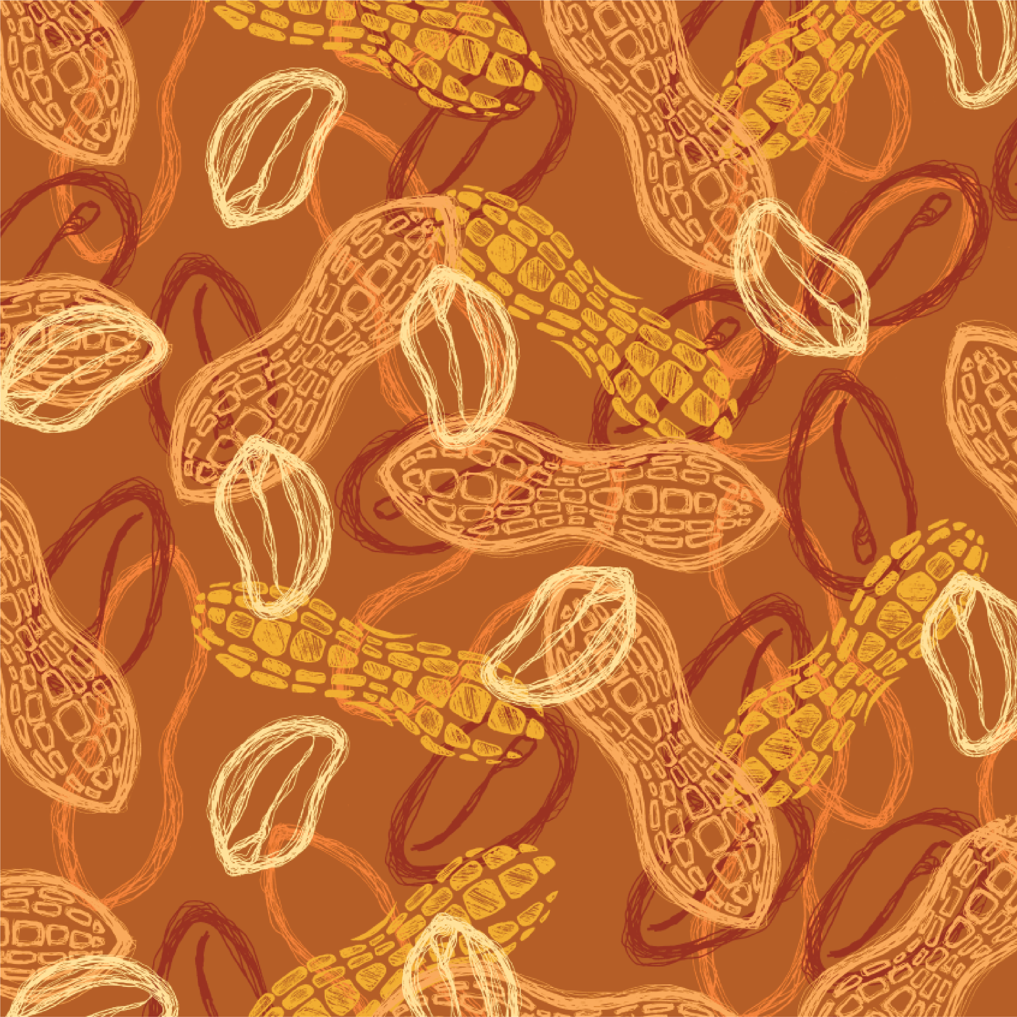
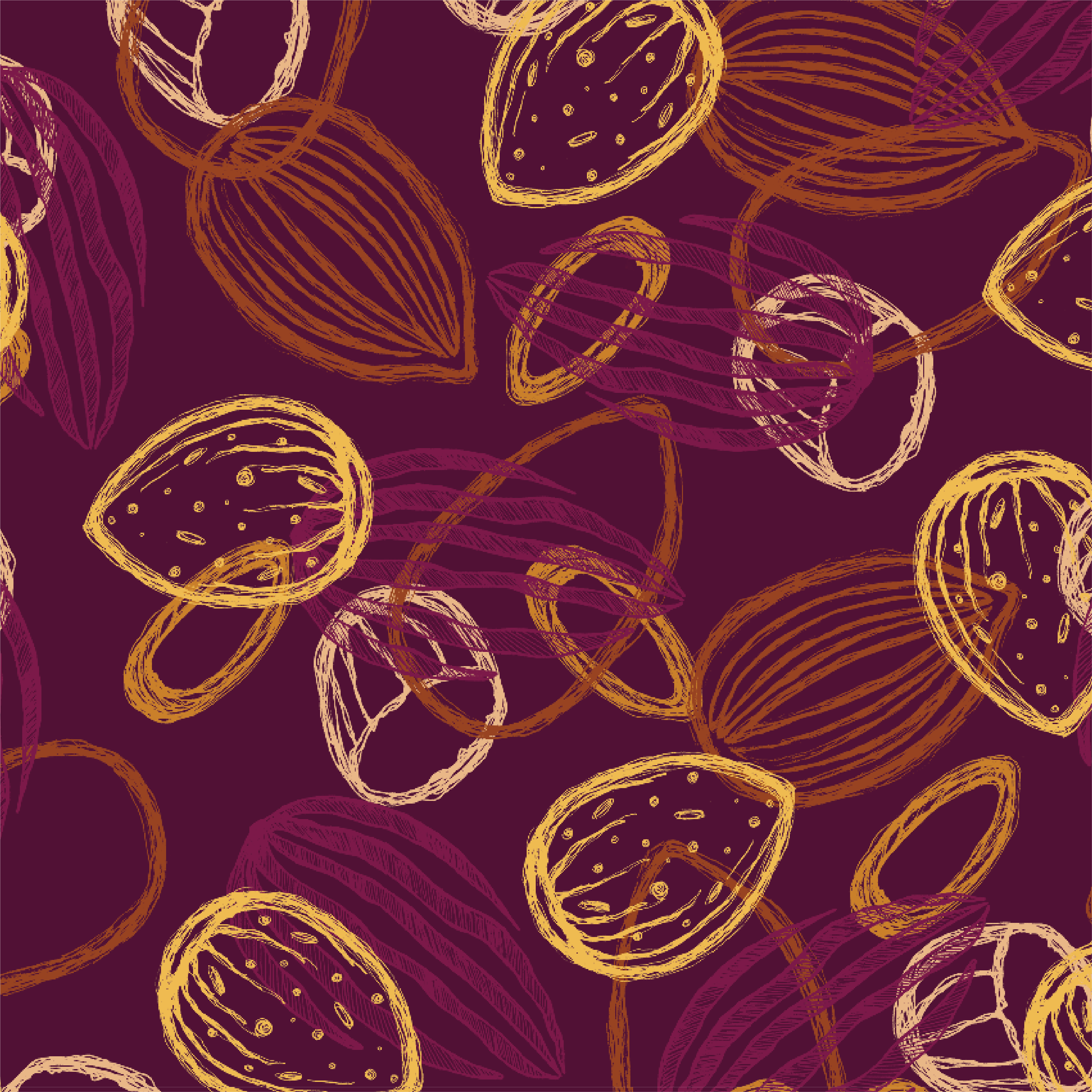
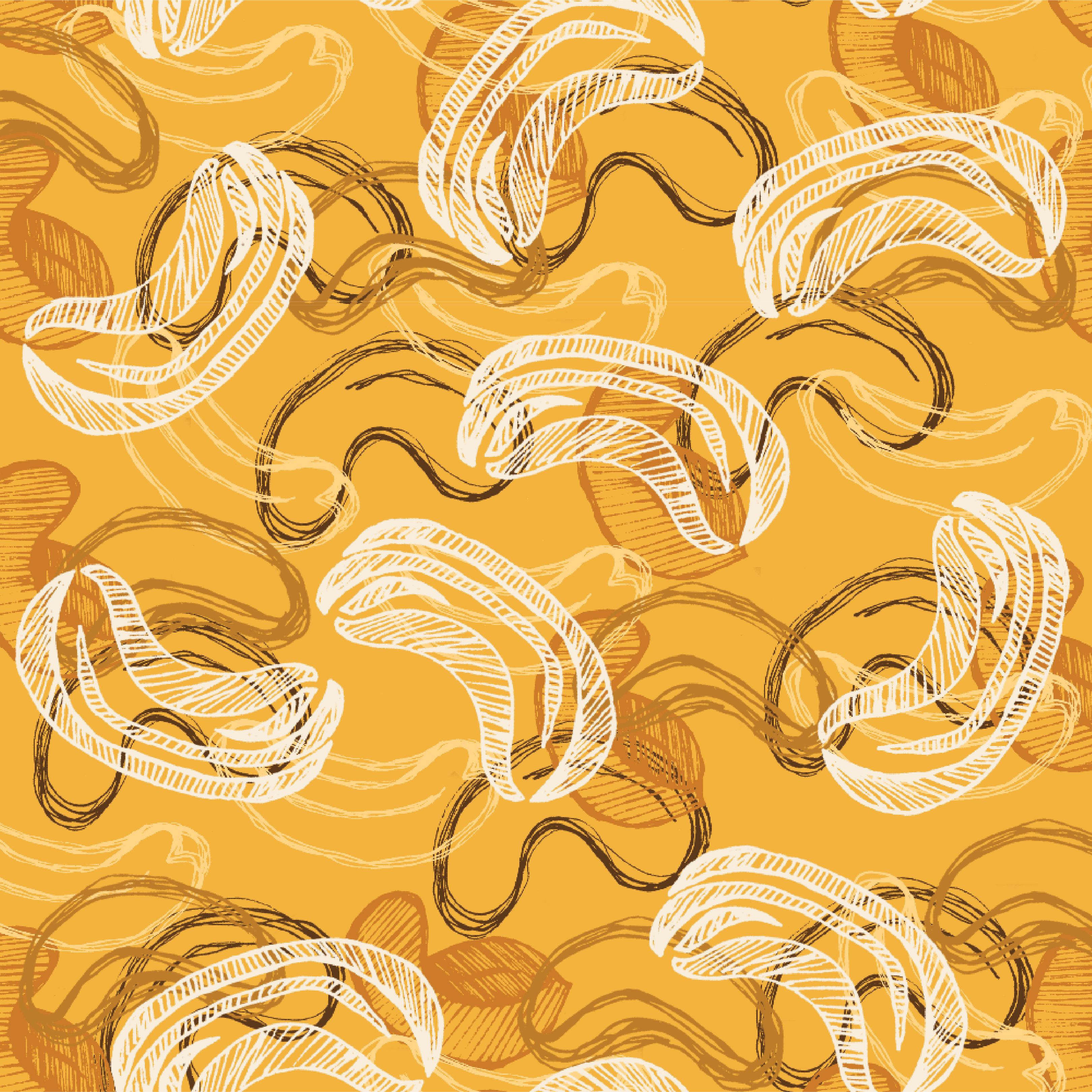
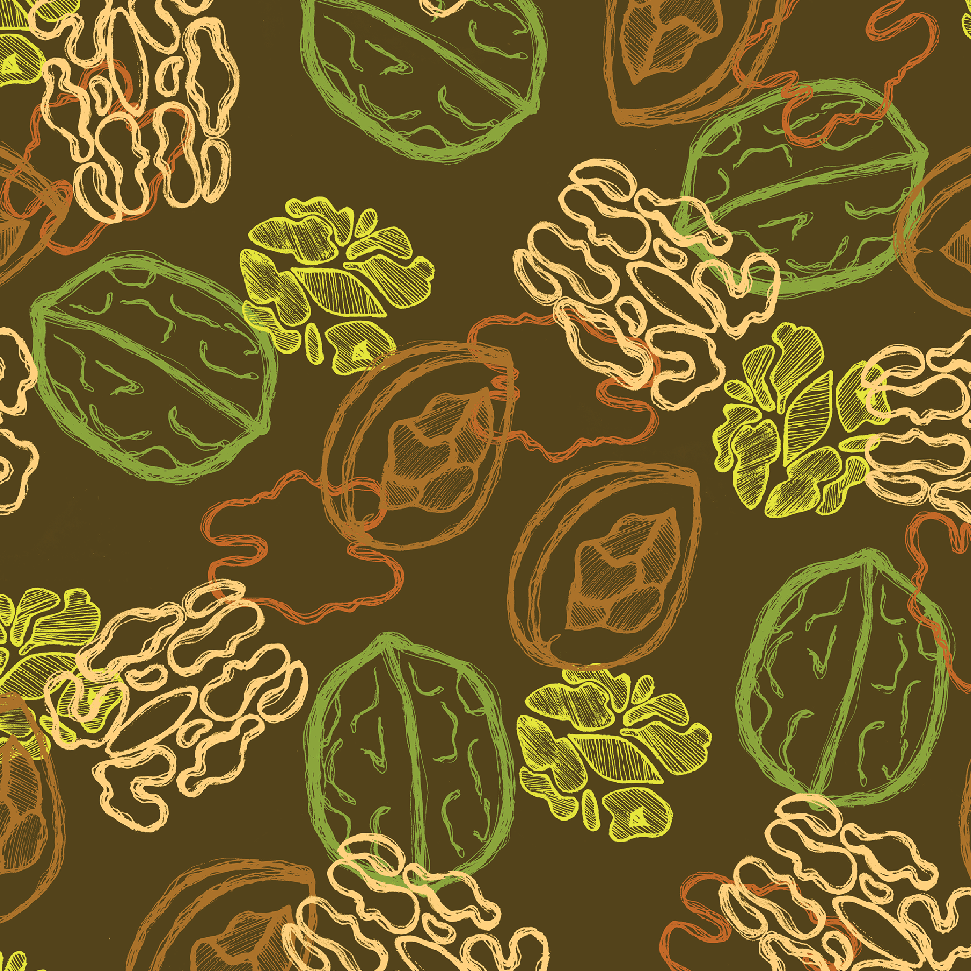
To emphasize being all-natural and delicious, I drew layered nutty patterns for each flavor’s nut: cashews, walnuts, peanuts, and almonds. This textural, organic element gives the design an approachable, artisan quality.
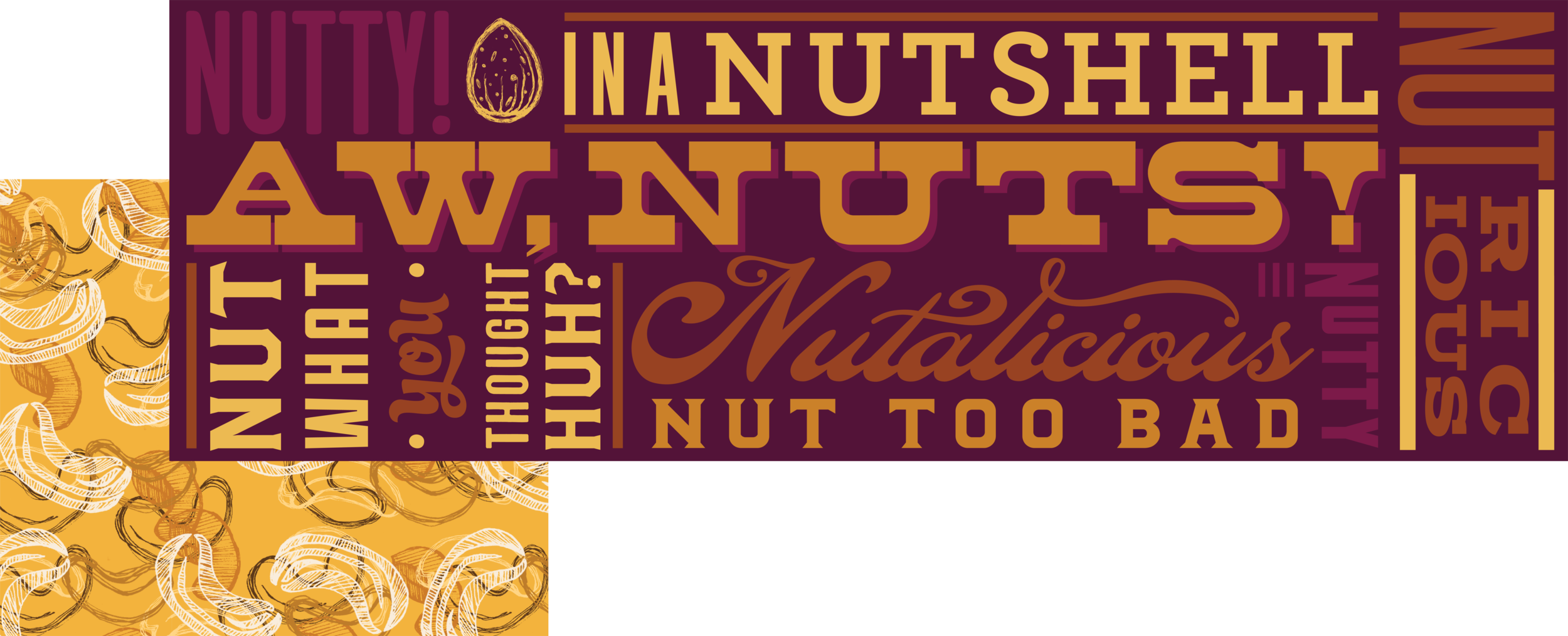
Typography
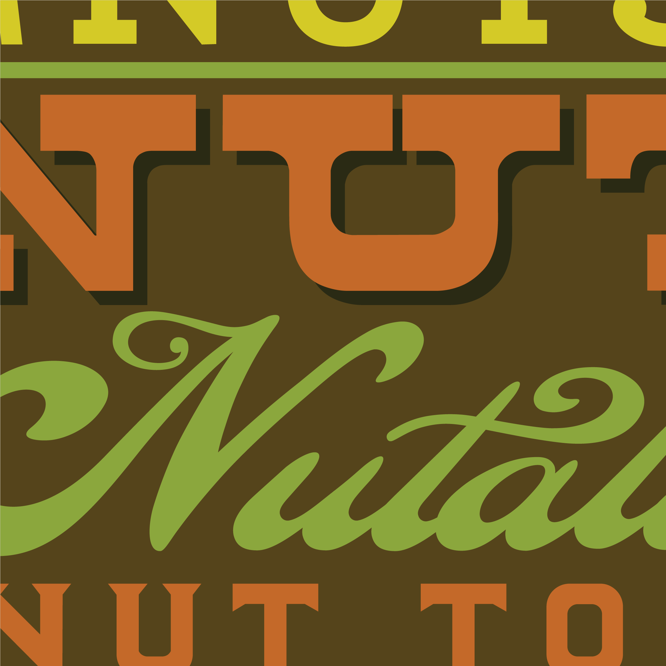
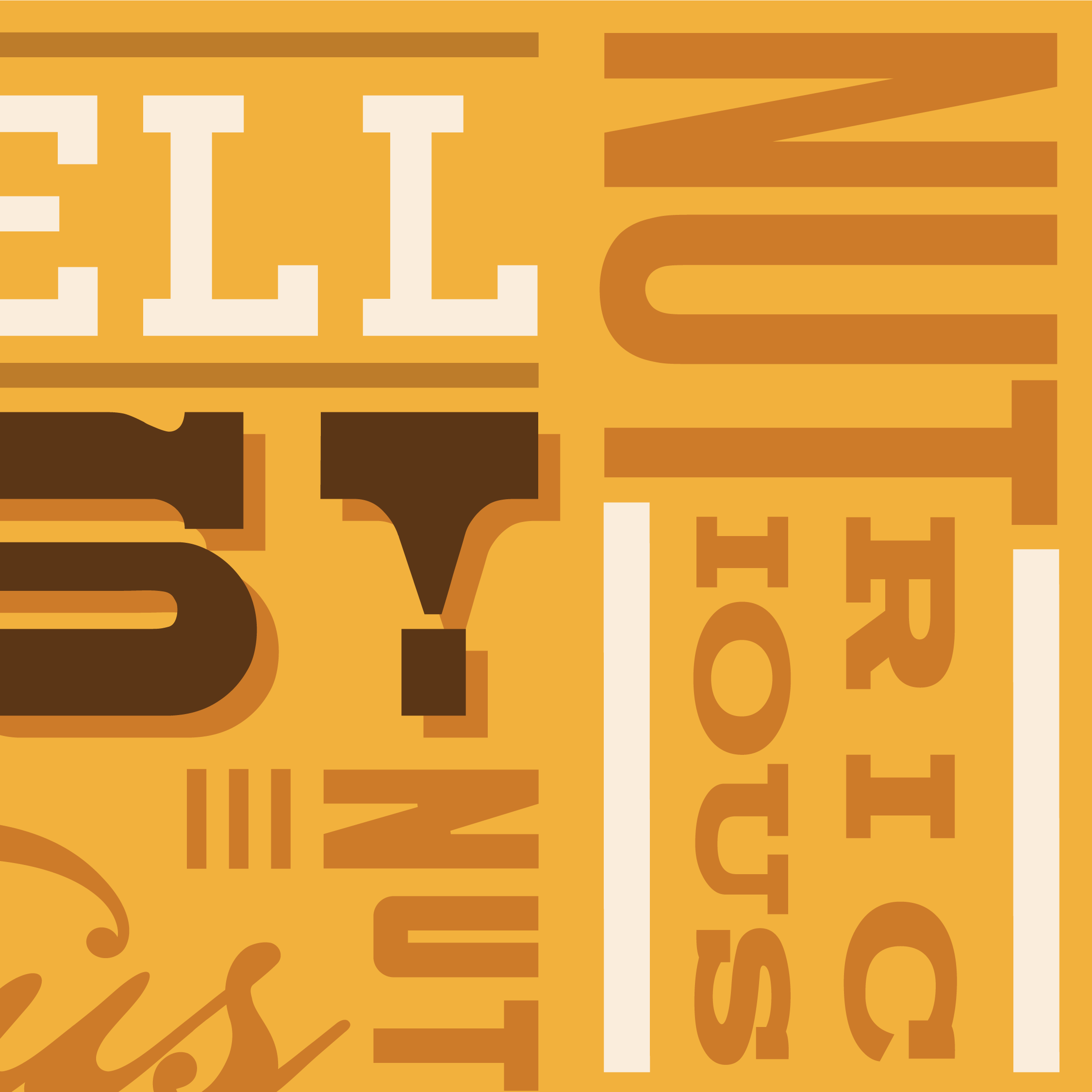
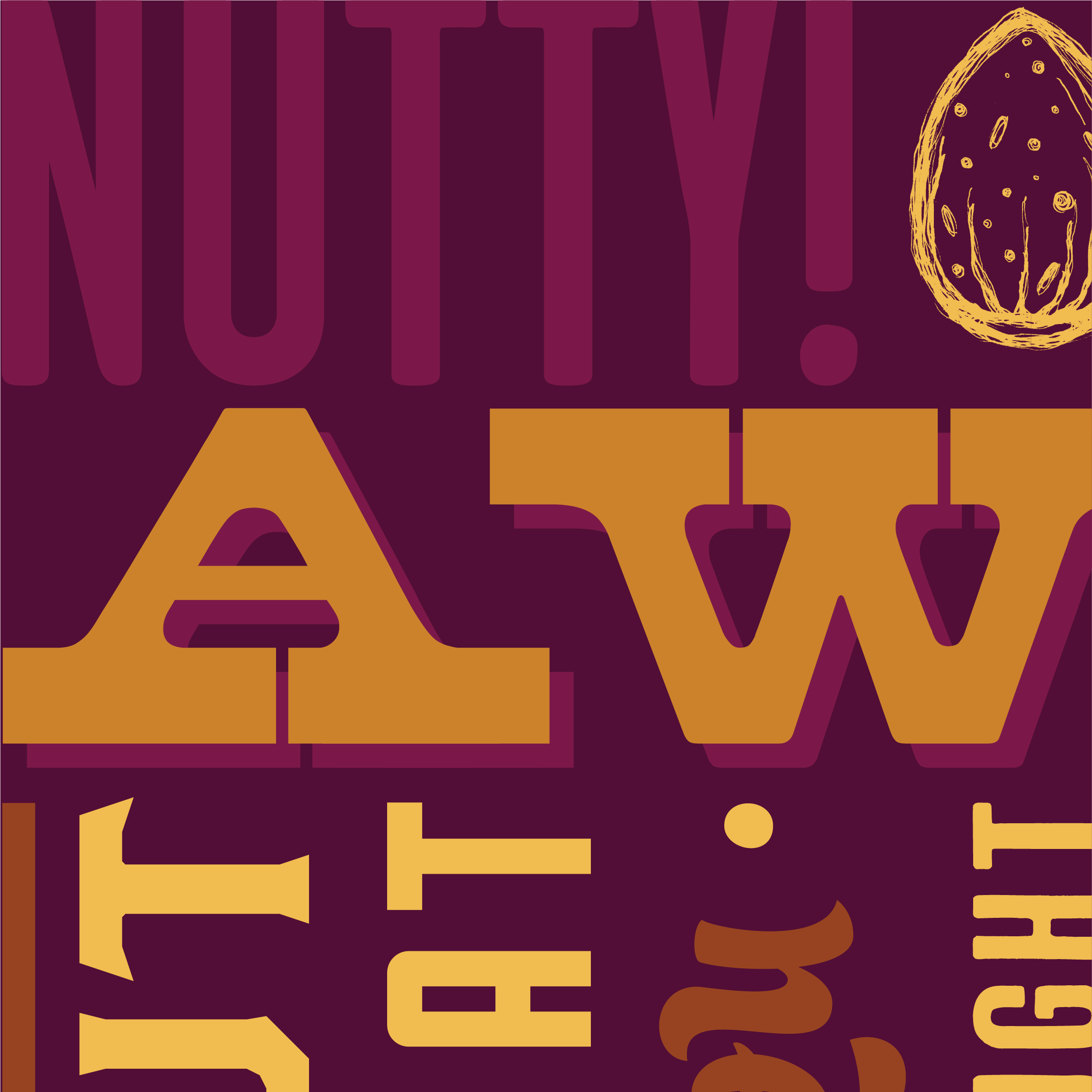
For the bulk packages, I designed a lockup of "Nutty Quips.” The playful design connects with the shopper and creates a lasting impression encouraging shoppers to remember to buy.
Full side of a box
Snippets of all the flavors

Display Boxes
For wholesale and retail, I designed bulk boxes that doubled as display. The boxes could be opened and displayed upright, functioning as signage to further make the brand stand out.

Other Projects

Case Study
Fitrix Energy Balls
Getting nutty about nutrition
Fitrix energy balls debuted as a truly delicious and nutritious snack with short list of ingredients, challenging their bland tasting, sporty energy-bar competition. The challenge was two-fold: design packaging that stands out as all-natural, high-quality, and delicious while respecting the start-up's initial tight budget. I designed a label for budget-friendly clamshells with rich, natural textures and a down-to-earth sense of humor to create a highly approachable and energetic brand.
Design
Cora Woodward
Creative Direction
Cesar Sanchez
Visual Identity: Humor & Natural Texture
The brand personality is down to earth, fun, and built around the simple, powerful concept: nuts are nature's perfect energy source. To differentiate Fitrix from sterile, high-performance competitors, we created a dynamic, natural, and flavorful look.
Photography
Product photography was carefully executed to showcase the whole, identifiable, high-quality ingredients for each specific flavor, reinforcing the product's premium, natural positioning.
Color
Each flavor is differentiated using a vibrant color scheme pulled directly from its rich ingredients Overlapping color elements were used to create a kinetic, energetic feel that pops on the shelf.
Hand-Drawn Patterns
To emphasize being all-natural and delicious, I drew layered nutty patterns for each flavor’s nut: cashews, walnuts, peanuts, and almonds. This textural, organic element gives the design an approachable, artisan quality.
Typography
For the bulk packages, I designed a lockup of "Nutty Quips.” The playful design connects with the shopper and creates a lasting impression encouraging shoppers to remember to buy.
Full side of a box
Snippets of all the flavors
Display Boxes
For wholesale and retail, I designed bulk boxes that doubled as display. The boxes could be opened and displayed upright, functioning as signage to further make the brand stand out.

Other Projects

Case Study
Fitrix Energy Balls
Getting nutty about nutrition
Fitrix energy balls debuted as a truly delicious and nutritious snack with short list of ingredients, challenging their bland tasting, sporty energy-bar competition. The challenge was two-fold: design packaging that stands out as all-natural, high-quality, and delicious while respecting the start-up's initial tight budget. I designed a label for budget-friendly clamshells with rich, natural textures and a down-to-earth sense of humor to create a highly approachable and energetic brand.
Packaging
Art Direction
Illustration
Design
Cora Woodward
Creative Direction
Cesar Sanchez
Visual Identity: Natural Textures & Nutty Humor
The brand personality is down to earth, fun, and built around the simple, powerful concept: nuts are nature's perfect energy source. To differentiate Fitrix from sterile, high-performance competitors, we created a dynamic, natural, and flavorful look.
Photography
Product photography was carefully executed to showcase the whole, identifiable, high-quality ingredients for each specific flavor, reinforcing the product's premium, natural positioning.
Color
Each flavor is differentiated using a vibrant color scheme pulled directly from its rich ingredients Overlapping color elements were used to create a kinetic, energetic feel that pops on the shelf.
Hand-Drawn Patterns
To emphasize being all-natural and delicious, I drew layered nutty patterns for each flavor’s nut: cashews, walnuts, peanuts, and almonds. This textural, organic element gives the design an approachable, artisan quality.
Typography
For the bulk packages, I designed a lockup of "Nutty Quips.” The playful design connects with the shopper and creates a lasting impression encouraging shoppers to remember to buy.
Full side of a box
Snippets of all the flavors
Display Boxes
For wholesale and retail, I designed bulk boxes that doubled as display. The boxes could be opened and displayed upright, functioning as signage to further make the brand stand out.

Other Projects