
Work
About
Contact
Case Study
DSO Season At-A-Glance
Designing a musical outing, from plan to performance
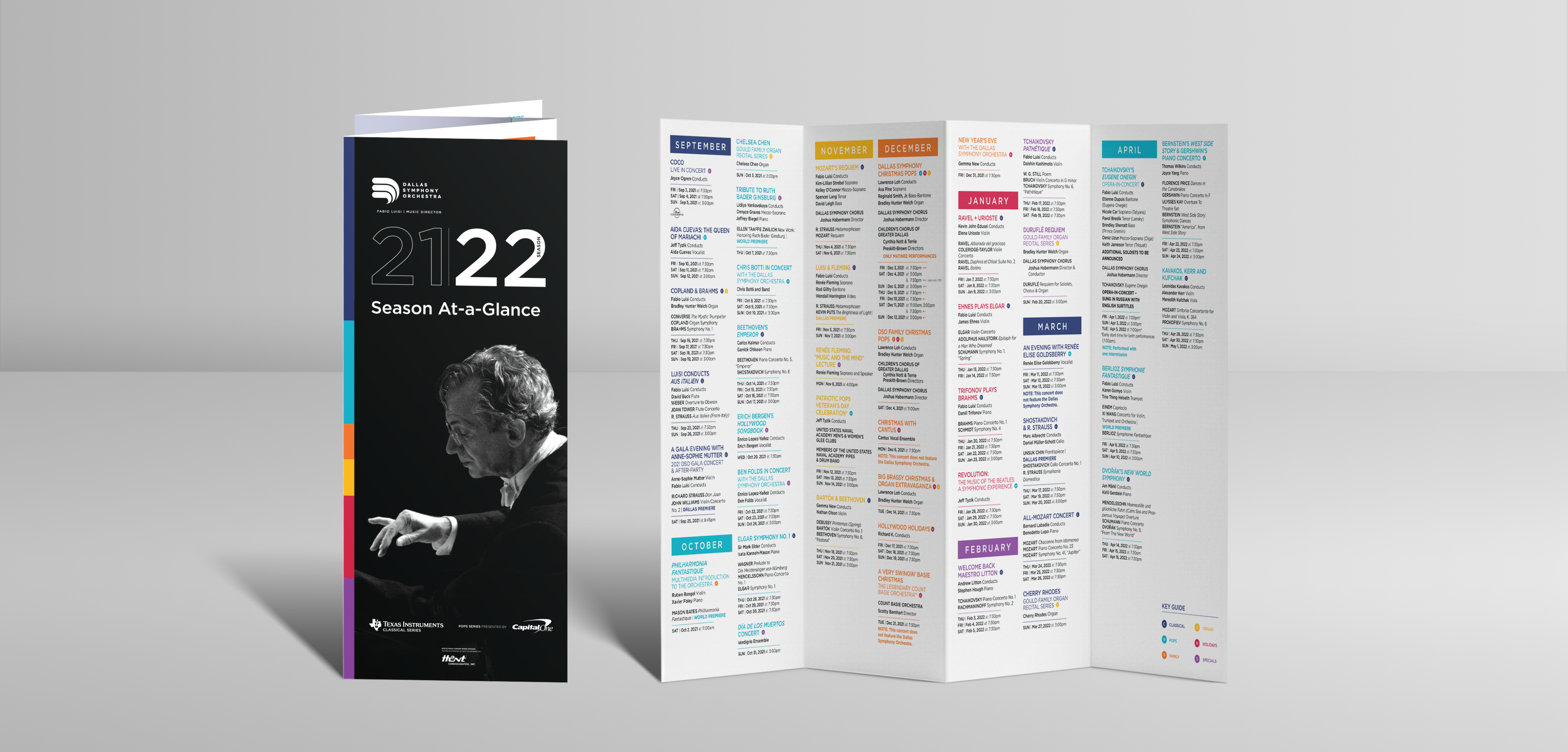
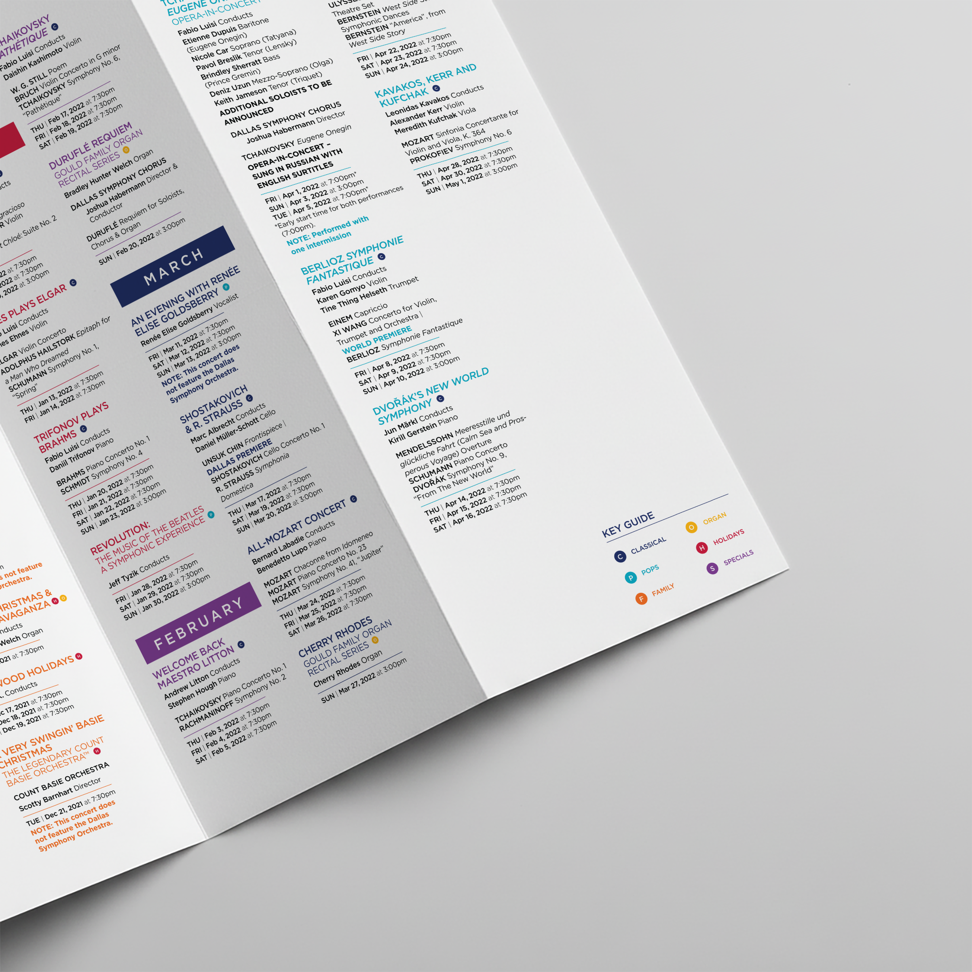
The Dallas Symphony Orchestra required a compact companion piece for their annual donor packet. The design challenge was to create a guide that would simplify the extensive 2021-2022 season schedule. Our solution was a strategically designed accordion-fold brochure that was intuitive for skimming and planning while upholding the DSO’s prestige and branding.
Design
Cora Woodward
Creative Direction
Laurie Coughlin
Strategy
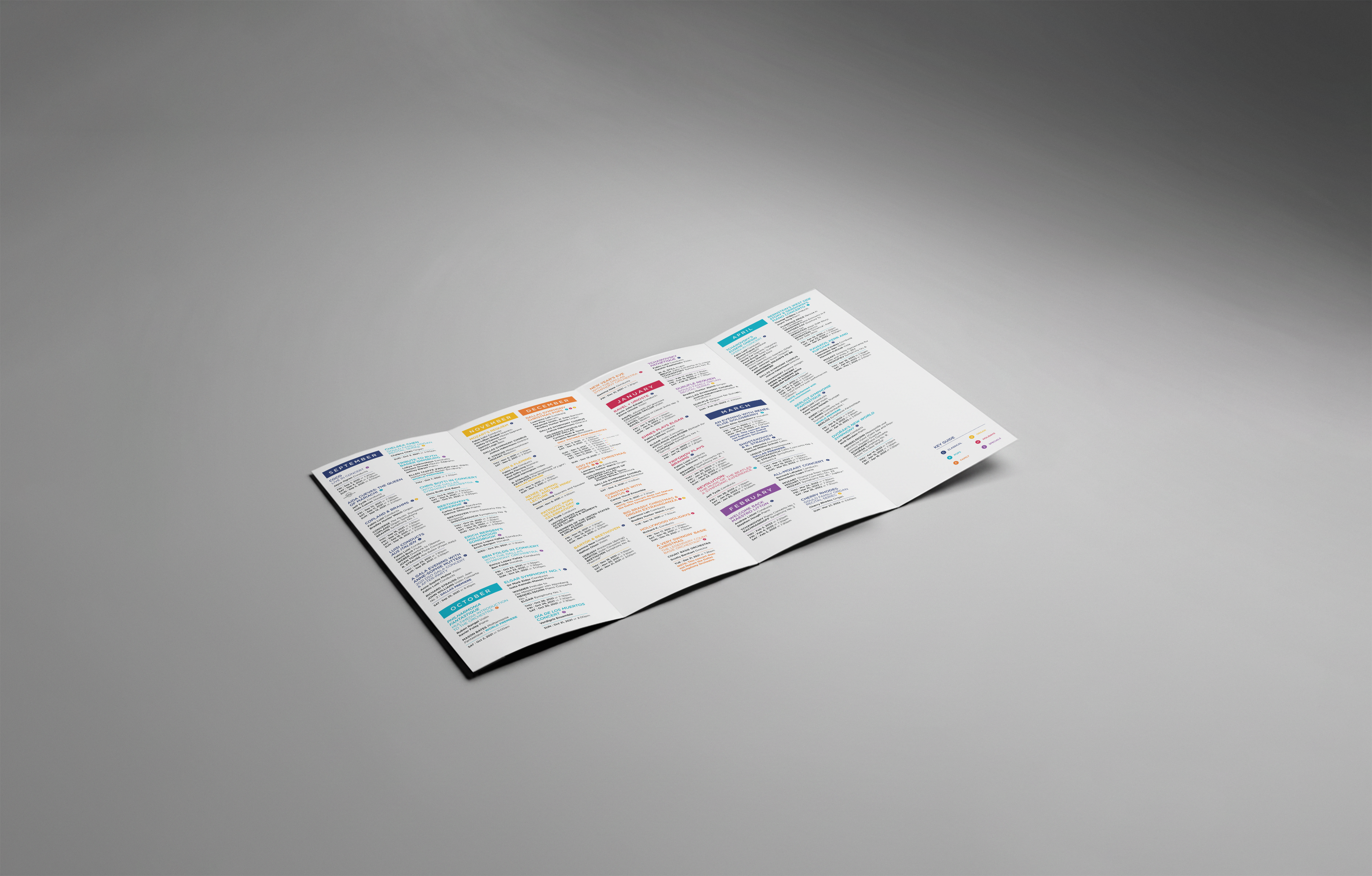
The solution was the "Season At-a-Glance," a strategically designed accordion-fold brochure delivered directly to donors and members. Functionality was paramount: the interior layout presents all concerts in vertical, month-by-month columns. This allows the user to easily fold the piece to reference only the current or desired part of the year. Crucially, the reverse side of the foldout provides an immediate reference to the venue with a comprehensive seating map, fully integrating the planning process from selecting a date to securing the perfect seat.
Design
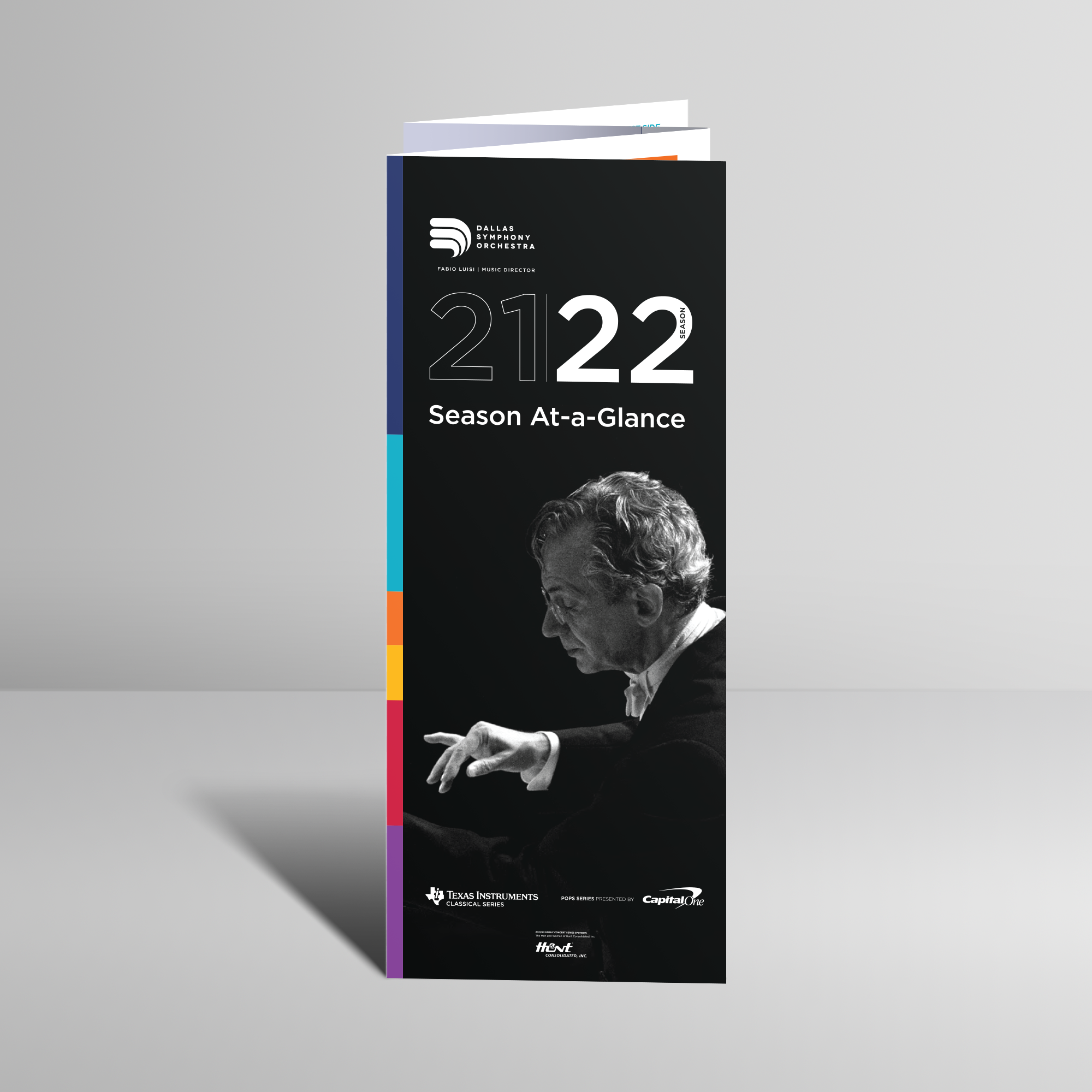
The guide’s utility is driven by a powerful visual hierarchy with months heading off the columns, and by utilizing color-coded icons to instantly categorize and distinguish between various concert types. The color palette is established on the cover, which also features the highly admired conductor Fabio Luisi, blending essential branding (DSO logo, sponsor logos) with the season's fresh aesthetic. The palette successfully rounds out the DSO’s dark and light blues with warmer tones, translating directly into the color-coded key inside.
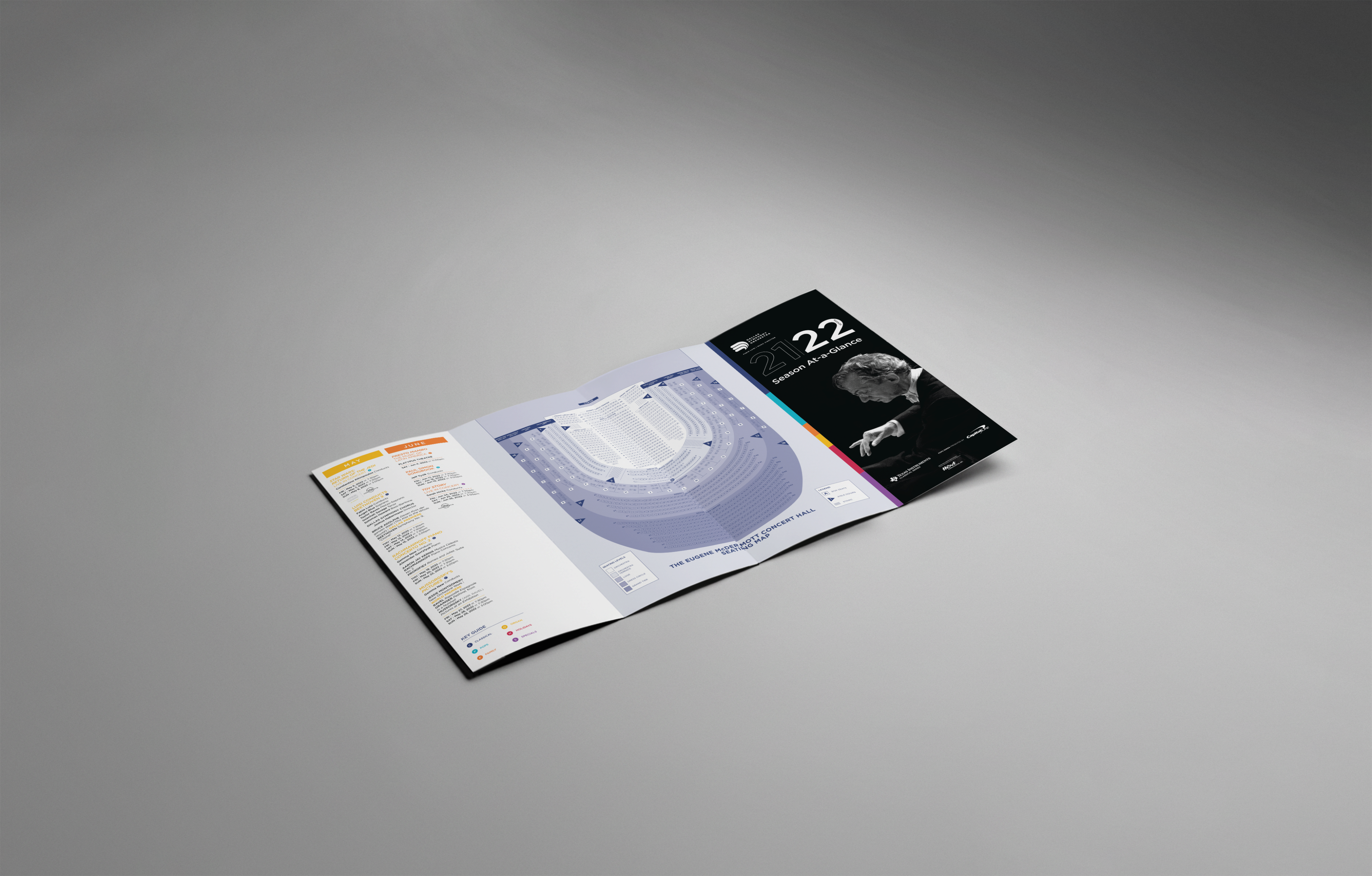
Crucially, the reverse side of the foldout provides an immediate reference to the venue with a comprehensive seating map, fully integrating the planning process from selecting a date to securing the perfect seat. This piece serves as a fundamental, scannable reference, making engagement with the full symphony schedule accessible and enjoyable.
Conclusion
The guide’s utility is driven by a powerful visual hierarchy with months heading off the columns, and by utilizing color-coded icons to instantly categorize and distinguish between various concert types. The color palette is established on the cover, which also features the highly admired conductor Fabio Luisi, blending essential branding (DSO logo, sponsor logos) with the season's fresh aesthetic. The palette successfully rounds out the DSO’s dark and light blues with warmer tones, translating directly into the color-coded key inside.

Other Projects


Case Study
DSO Season At-A-Glance
Designing a musical outing, from plan to performance
The Dallas Symphony Orchestra required a compact companion piece for their annual donor packet. The design challenge was to create a guide that would simplify the extensive 2021-2022 season schedule. Our solution was a strategically designed accordion-fold brochure that was intuitive for skimming and planning while upholding the DSO’s prestige and branding.
Design
Cora Woodward
Creative Direction
Laurie Coughlin
Strategy
The solution was the "Season At-a-Glance," a strategically designed accordion-fold brochure delivered directly to donors and members. Functionality was paramount: the interior layout presents all concerts in vertical, month-by-month columns. This allows the user to easily fold the piece to reference only the current or desired part of the year. Crucially, the reverse side of the foldout provides an immediate reference to the venue with a comprehensive seating map, fully integrating the planning process from selecting a date to securing the perfect seat.
Design
The guide’s utility is driven by a powerful visual hierarchy with months heading off the columns, and by utilizing color-coded icons to instantly categorize and distinguish between various concert types. The color palette is established on the cover, which also features the highly admired conductor Fabio Luisi, blending essential branding (DSO logo, sponsor logos) with the season's fresh aesthetic. The palette successfully rounds out the DSO’s dark and light blues with warmer tones, translating directly into the color-coded key inside.
Crucially, the reverse side of the foldout provides an immediate reference to the venue with a comprehensive seating map, fully integrating the planning process from selecting a date to securing the perfect seat. This piece serves as a fundamental, scannable reference, making engagement with the full symphony schedule accessible and enjoyable.
Conclusion
The guide’s utility is driven by a powerful visual hierarchy with months heading off the columns, and by utilizing color-coded icons to instantly categorize and distinguish between various concert types. The color palette is established on the cover, which also features the highly admired conductor Fabio Luisi, blending essential branding (DSO logo, sponsor logos) with the season's fresh aesthetic. The palette successfully rounds out the DSO’s dark and light blues with warmer tones, translating directly into the color-coded key inside.

Other Projects

Case Study
DSO Season At-A-Glance
Designing a musical outing, from plan to performance
The Dallas Symphony Orchestra required a compact companion piece for their annual donor packet. The design challenge was to create a guide that would simplify the extensive 2021-2022 season schedule. Our solution was a strategically designed accordion-fold brochure that was intuitive for skimming and planning while upholding the DSO’s prestige and branding.
Design
Cora Woodward
Creative Direction
Laurie Coughlin
Strategy
Functionality was paramount: the interior layout presents all concerts in vertical, month-by-month columns. This allows the user to easily fold the piece to reference only the current or desired part of the year. Crucially, the reverse side of the foldout provides an immediate reference to the venue with a comprehensive seating map, fully integrating the planning process from selecting a date to securing the perfect seat.
Design
The color palette is established on the cover, which also features the highly admired conductor Fabio Luisi, blending essential branding (DSO logo, sponsor logos) with the season's fresh aesthetic. The palette successfully rounds out the DSO’s dark and light blues with warmer tones, translating directly into the color-coded key inside.
The guide’s utility is driven by a powerful visual hierarchy with months heading off the columns, and by utilizing color-coded icons to instantly categorize and distinguish between various concert types.
Conclusion
This piece served as a fundamental, scannable reference, making engagement with the full symphony schedule accessible and enjoyable.

Other Projects