Work
About
Contact
Case Study
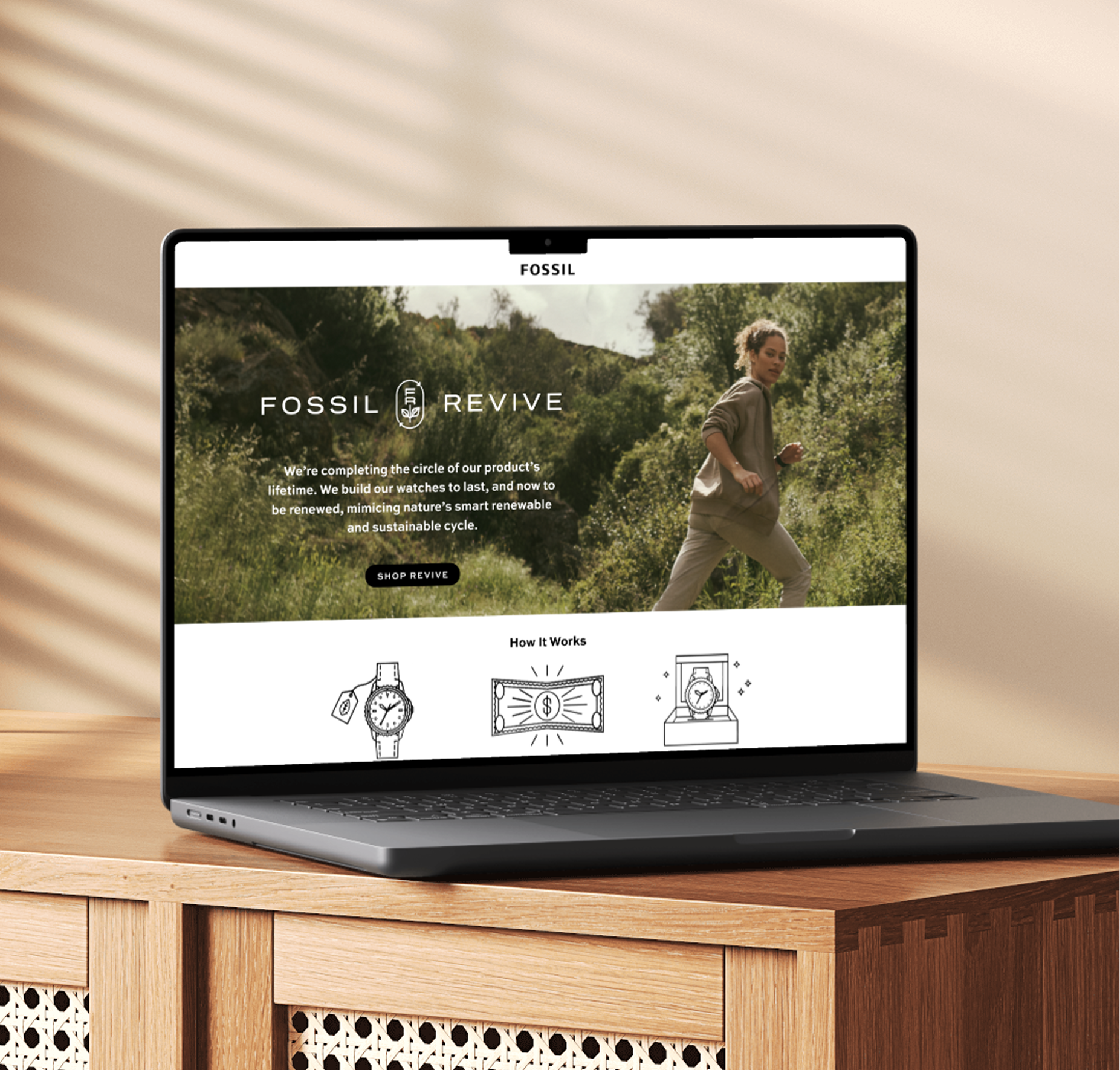
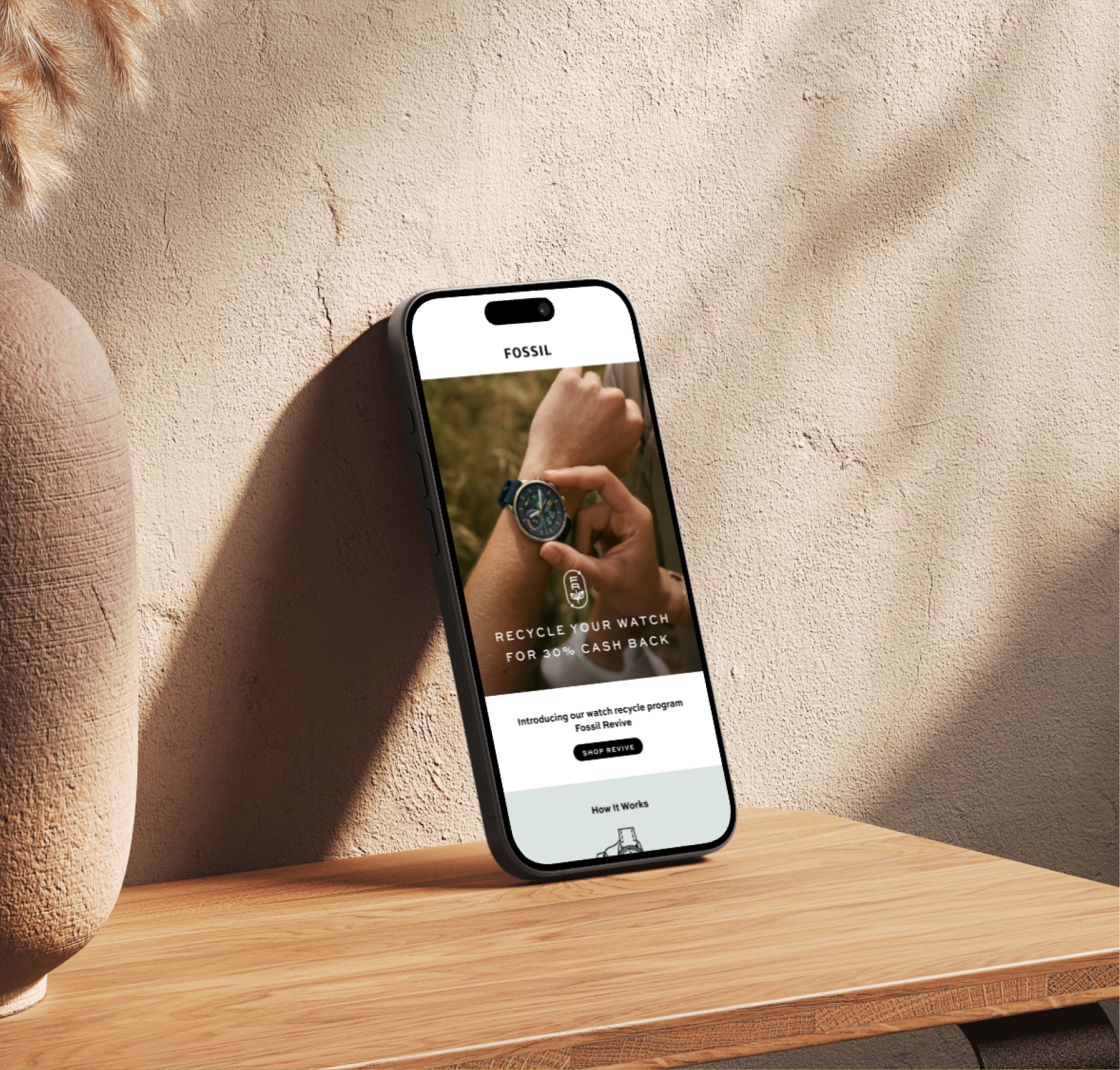
Fossil Revive
Designing for a renewable tomorrow
Fossil Revive is a new program aiming to create sustainability for the fashion brand’s products. The program allows customers to return their cherished watches for a percentage cash back, which then are reconditioned with care. The challenge was to overcome the negative stigma often associated with recycling and buying reconditioned items. We changed the narrative by highlighting Fossil’s high quality which makes their products eco-friendly due to their longevity and repairability, creating the opportunity for renewal. Fossil Revive adds the final step of their sustainable lifecycle, closing the loop of the product’s lifetime.
Design
Cora Woodward
Creative Direction
Sara Stanley
The Lettermark
The letter-mark includes a stem and leaf, symbolizing renewal and the program's eco-friendly values. The oval container made of arrows encircles the letter mark and alludes to closing the loop of the watch’s lifecycle.

Pattern Design
The pattern uses abstracted watch gears and watch faces as repeating graphic elements. These mechanical pieces are interspersed with the circular arrow icon and the 'FR' initials, creating a dynamic, cohesive texture that is both industrial and organic.


Illustration
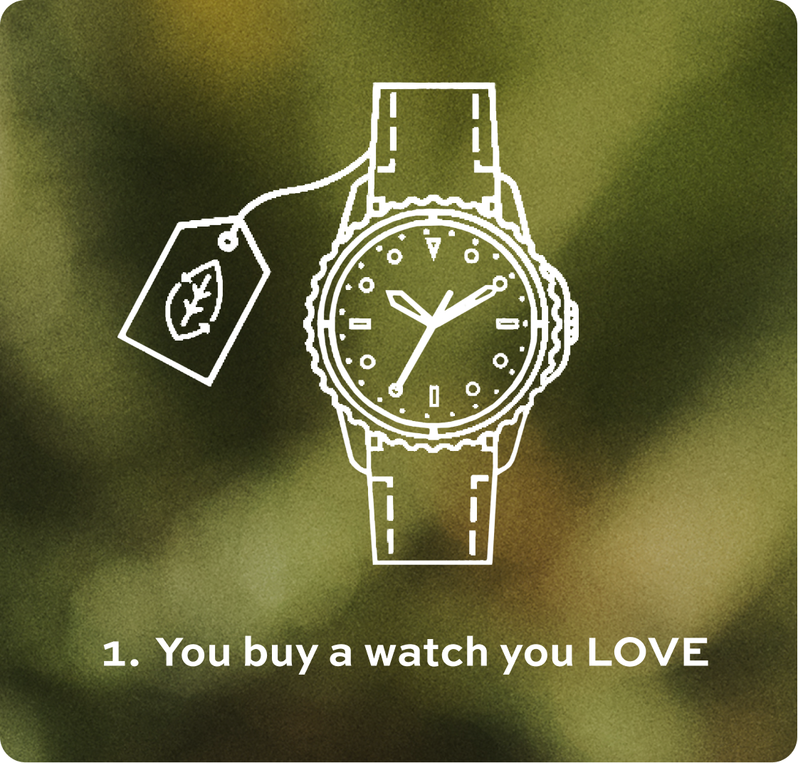
I drew three simplified line-art illustrations to clearly guide the customer through the return process. This step-by-step visual guidance makes the eco-friendly program accessible and inspiring.


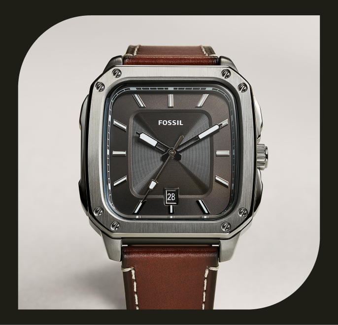
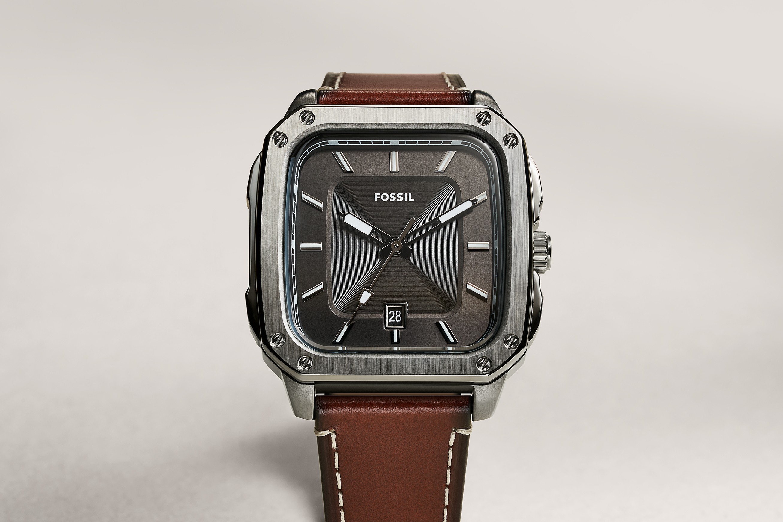
Photography Art Direction
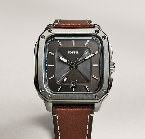
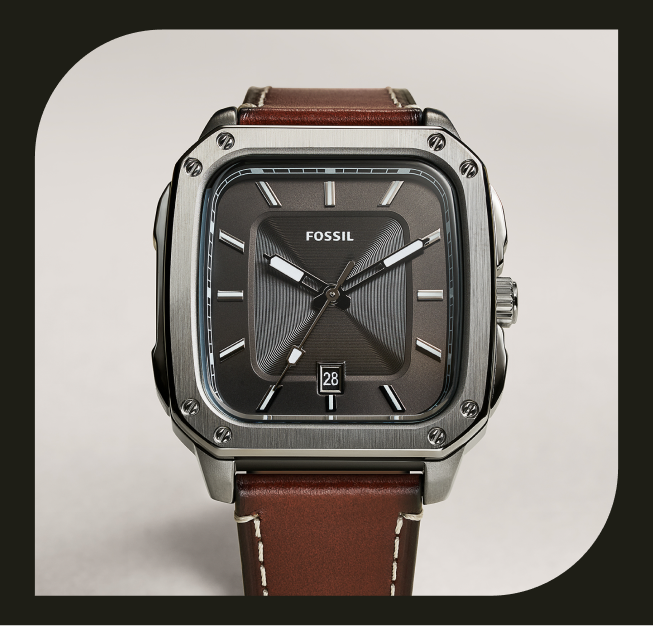
The photography art direction was chosen to contrast content against soft, natural backdrops. This approach communicates that the program is about caring for the earth and quality over quantity, ensuring that Fossil Revive makes recycling feel sophisticated, valuable, and consistent with the brand's commitment to quality craftsmanship.


Conclusion
The Fossil Revive branding successfully established an identity that is both authentic to sustainability and aspirational to the Fossil consumer. By translating complex concepts like the circular economy into elegant, watch-inspired graphics, the program feels elevated. The brand positions Fossil Revive as a luxurious, responsible choice that adds tangible value and ethical depth to the Fossil brand experience.

Other Projects

Case Study
Fossil Revive
Designing for a renewable tomorrow
Fossil Revive is a new program aiming to create sustainability for the fashion brand’s products. The program allows customers to return their cherished watches for a percentage cash back, which then are reconditioned with care. The challenge was to overcome the negative stigma often associated with recycling and buying reconditioned items. We changed the narrative by highlighting Fossil’s high quality which makes their products eco-friendly due to their longevity and repairability, creating the opportunity for renewal. Fossil Revive adds the final step of their sustainable lifecycle, closing the loop of the product’s lifetime.
Design
Cora Woodward
Creative Direction
Sara Stanley
The Lettermark
The letter-mark includes a stem and leaf, symbolizing renewal and the program's eco-friendly values. The oval container made of arrows encircles the letter mark and alludes to closing the loop of the watch’s lifecycle.
Pattern Design
The pattern uses abstracted watch gears and watch faces as repeating graphic elements. These mechanical pieces are interspersed with the circular arrow icon and the 'FR' initials, creating a dynamic, cohesive texture that is both industrial and organic.

Illustration
I drew three simplified line-art illustrations to clearly guide the customer through the return process. This step-by-step visual guidance makes the eco-friendly program accessible and inspiring.
Photography Art Direction
The photography art direction was chosen to contrast content against soft, natural backdrops. This approach communicates that the program is about caring for the earth and quality over quantity, ensuring that Fossil Revive makes recycling feel sophisticated, valuable, and consistent with the brand's commitment to quality craftsmanship.

Conclusion
The Fossil Revive branding successfully established an identity that is both authentic to sustainability and aspirational to the Fossil consumer. By translating complex concepts like the circular economy into elegant, watch-inspired graphics, the program feels elevated. The brand positions Fossil Revive as a luxurious, responsible choice that adds tangible value and ethical depth to the Fossil brand experience.

Other Projects