Work
About
Contact
Case Study
Licorice Scottie Dogs
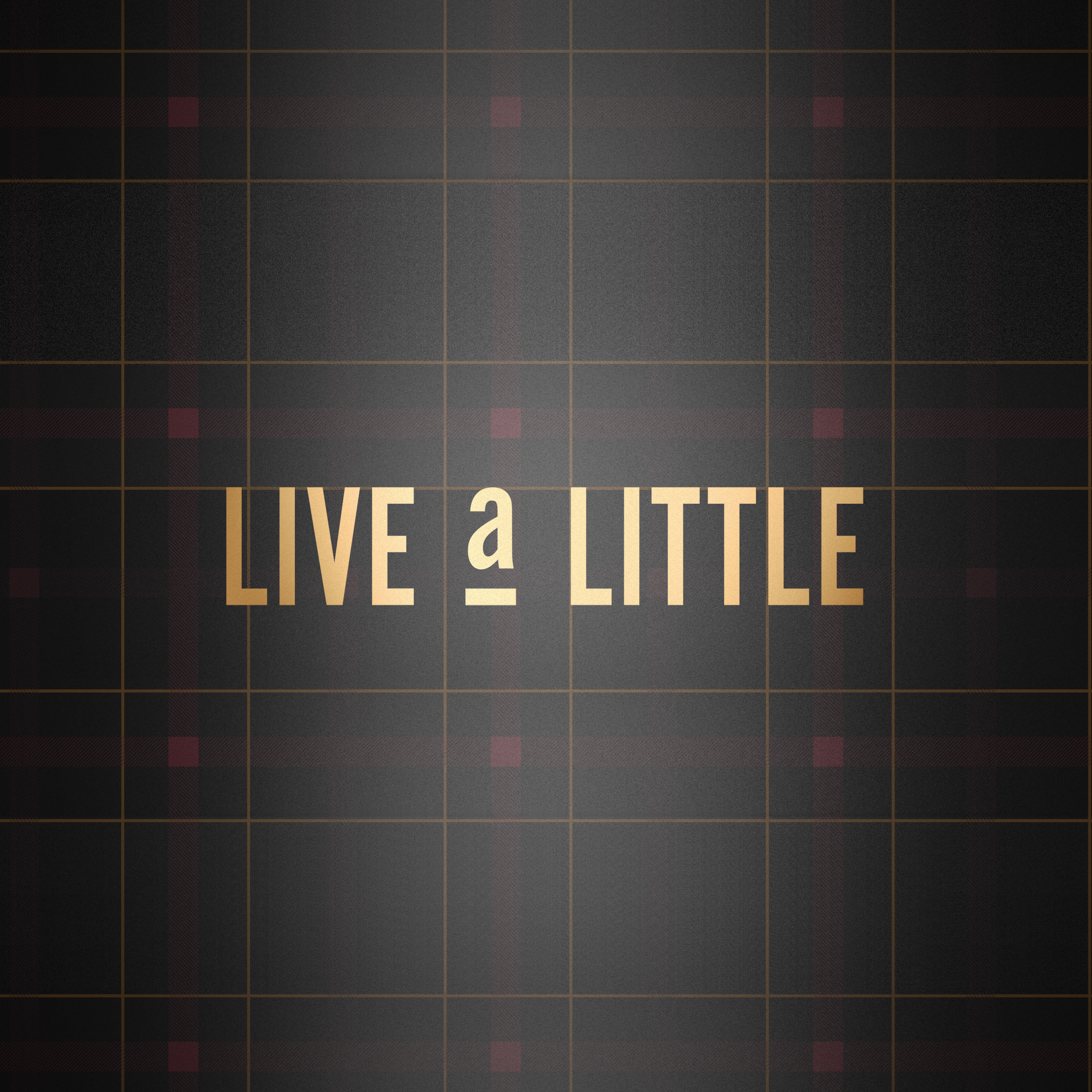
Packaging the Whimsy of a Sweet Mascot
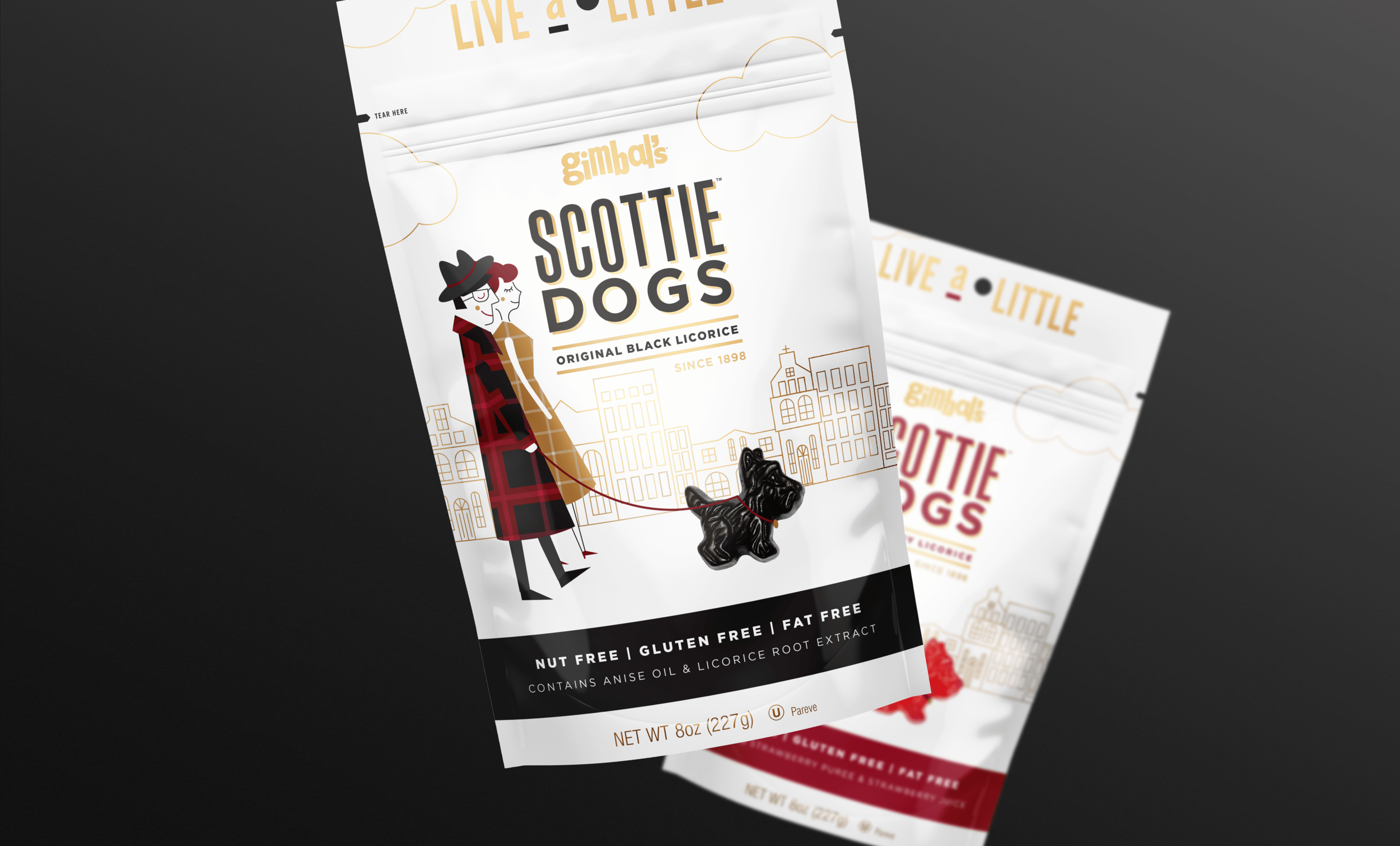
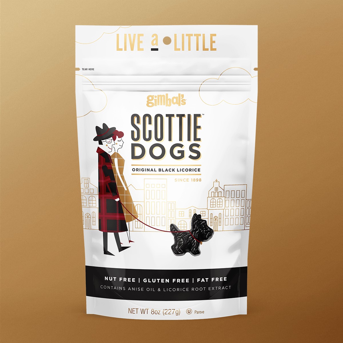
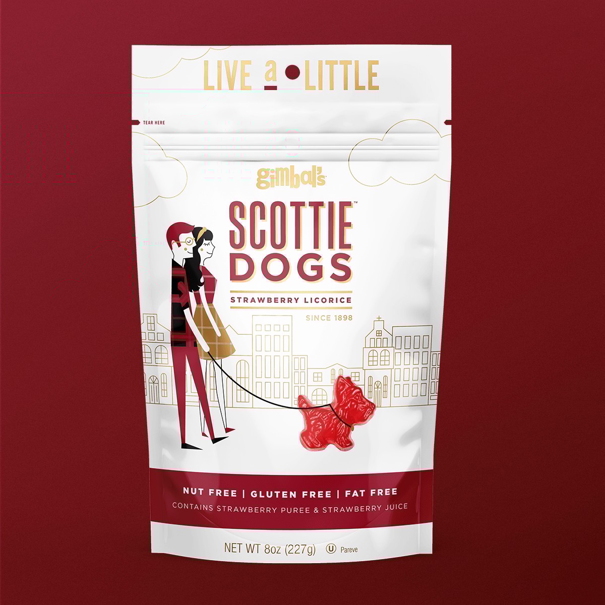
Gimbal's licorice Scottie Dogs are a heritage candy line with a loyal following of licorice enthusiasts. Gimbal’s wanted to keep up with their competitors whose simplified packaging was making a big impact in the candy scene. The new packaging simplified the exisiting iconic elements, and goes beyond an informational label telling a sweet story of a couple with their dog. The package was refreshed, making it feel current, premium, and fun.
Design
Cora Woodward
Creative Direction
Cesar Sanchez
Making it New
We kept the key elements of the old packaging: the Scottish plaid and the distinctive Scottie Dog shape. Then we translated them into a modern, approachable aesthetic. By keeping the plaid simple and changing the pouch to a bright white the packaging feel light and new. The white also provided a high-contrast canvas that made the colors of the licorice and the illustrations pop.
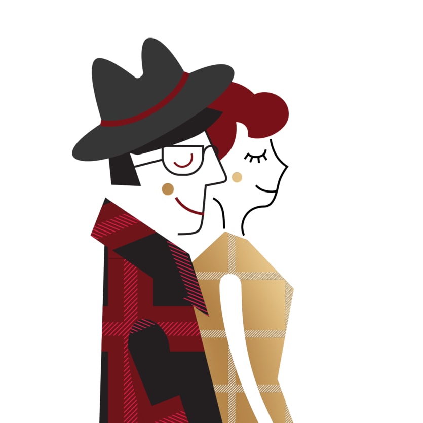
Illustration
For the packaging I illustrated the scene of a scottish couple walking their dog. The background features a quaint Scottish city street, rendered in simple, sophisticated line-work, which subtly establishes the setting. I drew a stylized couple taking a leisurely stroll. Their clothing incorporates the simplified tartan pattern, bridging the gap between old-world charm and contemporary style. In a key move to highlight the product, a life-sized licorice Scottie Dog is whimsically included on the walk, attached to a leash held by one of the characters.


Conclusion
For the packaging I illustrated the scene of a scottish couple walking their dog. The background features a quaint Scottish city street, rendered in simple, sophisticated line-work, which subtly establishes the setting. I drew a stylized couple taking a leisurely stroll. Their clothing incorporates the simplified tartan pattern, bridging the gap between old-world charm and contemporary style. In a key move to highlight the product, a life-sized licorice Scottie Dog is whimsically included on the walk, attached to a leash held by one of the characters.

Other Projects

Case Study
Licorice Scottie Dogs
Packaging the Whimsy of a Sweet Mascot
Gimbal's licorice Scottie Dogs are a heritage candy line with a loyal following of licorice enthusiasts. Gimbal’s wanted to keep up with their competitors whose simplified packaging was making a big impact in the candy scene. The new packaging simplified the exisiting iconic elements, and goes beyond an informational label telling a sweet story of a couple with their dog. The package was refreshed, making it feel current, premium, and fun.
Design
Cora Woodward
Creative Direction
Cesar Sanchez
Making it New
We kept the key elements of the old packaging: the Scottish plaid and the distinctive Scottie Dog shape. Then we translated them into a modern, approachable aesthetic. By keeping the plaid simple and changing the pouch to a bright white the packaging feel light and new. The white also provided a high-contrast canvas that made the colors of the licorice and the illustrations pop.
Illustration
For the packaging I illustrated the scene of a scottish couple walking their dog. The background features a quaint Scottish city street, rendered in simple, sophisticated line-work, which subtly establishes the setting. I drew a stylized couple taking a leisurely stroll. Their clothing incorporates the simplified tartan pattern, bridging the gap between old-world charm and contemporary style. In a key move to highlight the product, a life-sized licorice Scottie Dog is whimsically included on the walk, attached to a leash held by one of the characters.
Conclusion
For the packaging I illustrated the scene of a scottish couple walking their dog. The background features a quaint Scottish city street, rendered in simple, sophisticated line-work, which subtly establishes the setting. I drew a stylized couple taking a leisurely stroll. Their clothing incorporates the simplified tartan pattern, bridging the gap between old-world charm and contemporary style. In a key move to highlight the product, a life-sized licorice Scottie Dog is whimsically included on the walk, attached to a leash held by one of the characters.

Other Projects

Case Study
Licorice Scottie Dogs
Packaging the Whimsy of a Sweet Mascot
Gimbal's licorice Scottie Dogs are a heritage candy line with a loyal following of licorice enthusiasts. Gimbal’s wanted to keep up with their competitors whose simplified packaging was making a big impact in the candy scene. The new packaging simplified the existing iconic elements and told a sweet story of a couple with their dog. The final packaging was refreshed, making it feel current, premium, and fun.
Packaging
Design
Cora Woodward
Creative Direction
Cesar Sanchez
Making it New
We kept the key elements of the old packaging: the Scottish plaid and the distinctive Scottie Dog shape. Then we translated them into a modern, approachable aesthetic. By keeping the plaid simple and changing the pouch to a bright white the packaging feel light and new. The white also provided a high-contrast canvas that made the colors of the licorice and the illustrations pop.
Illustration
For the packaging I illustrated the scene of a Scottish couple walking their dog. The background features a quaint Scottish city street, rendered in simple, sophisticated line-work. Their clothing incorporates the simplified tartan pattern, bridging the gap between old-world charm and contemporary style. A life-sized licorice Scottie Dog is whimsically included on the walk, attached to a leash held by one of the characters.
Conclusion
The new illustration style and type treatment made the package more engaging, ensuring the classic Scottie Dog candy line could continue to appeal to loyal customers while attracting new, younger consumers on the shelf.

Other Projects