
Work
About
Contact
Case Study
Revenue HQ
Building Trust Through Familiarity
A developer approached us with a clear objective for his digital product: to build user trust through familiarity. The financial web app required a complete visual identity and a design system for older desktop users who preferred older interface designs. The core challenge was blending the trusted, structured feel of legacy software with a modernized and accessible design. The resulting system feels trustworthy while adhering strictly to UX best practices and ADA guidelines. The high-contrast system successfully merges classic desktop familiarity with a modern identity.
Design
Cora Woodward
Justin Smith
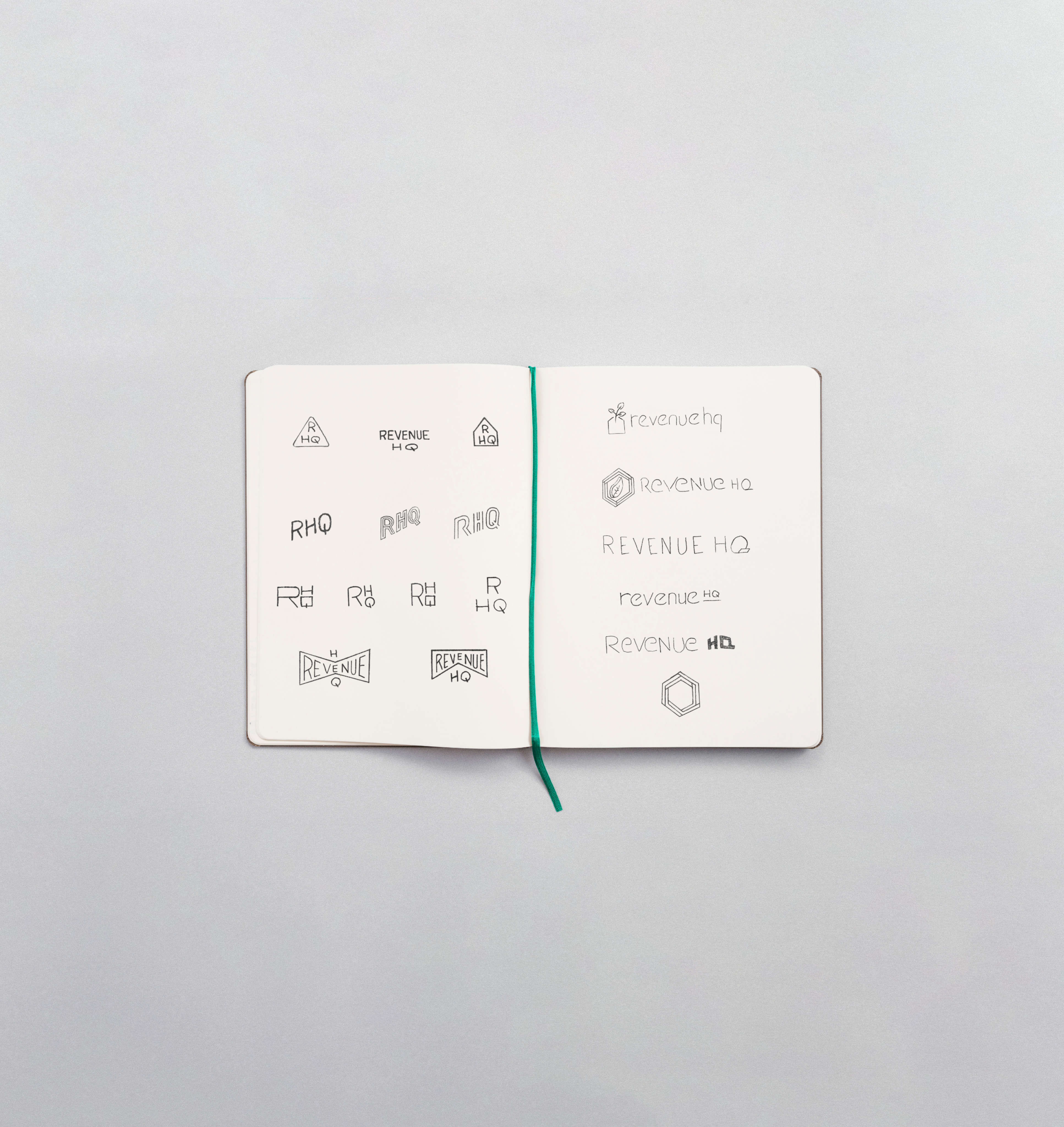
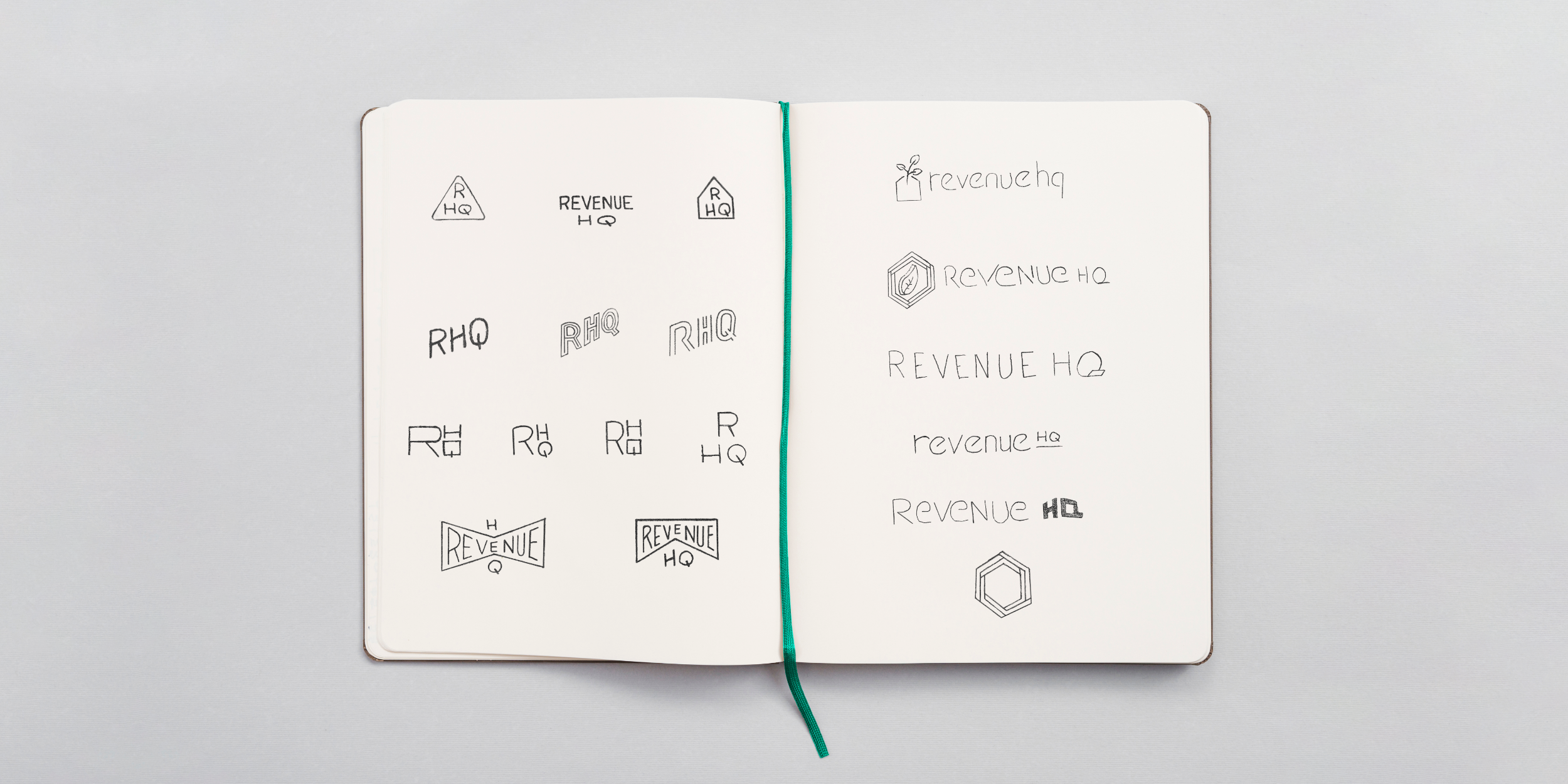
Ideation
Our ideation process focused on blending traditional financial concepts with modern digital clarity. After exploring various sketches (including initial attempts at geometric lettermarks and shield designs), the final concept merged growth and structure.
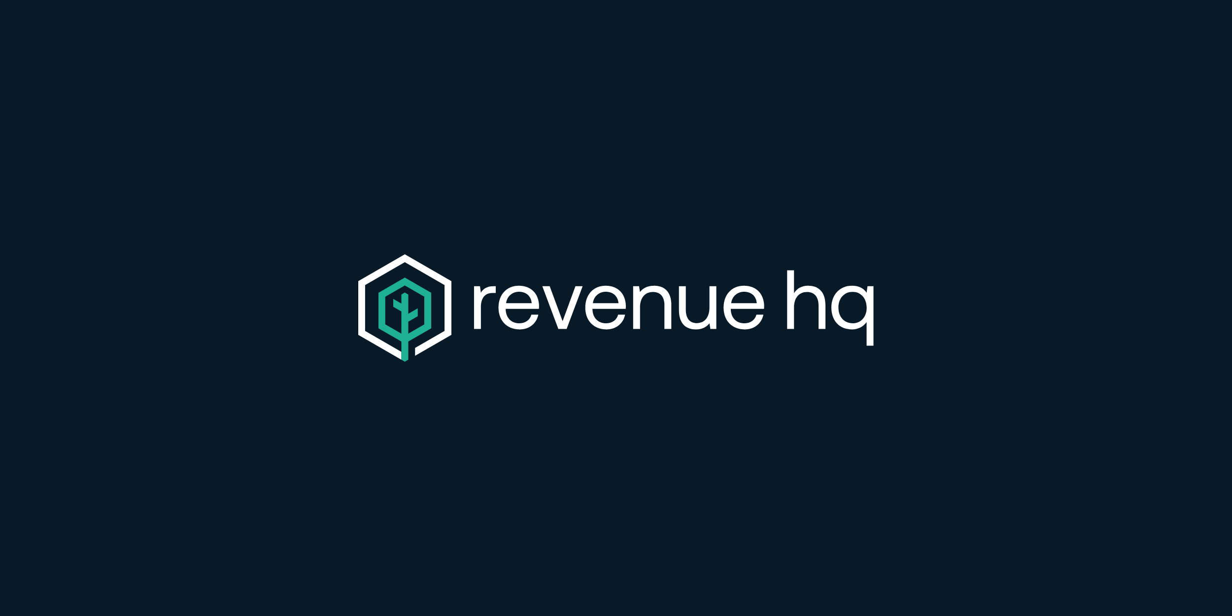
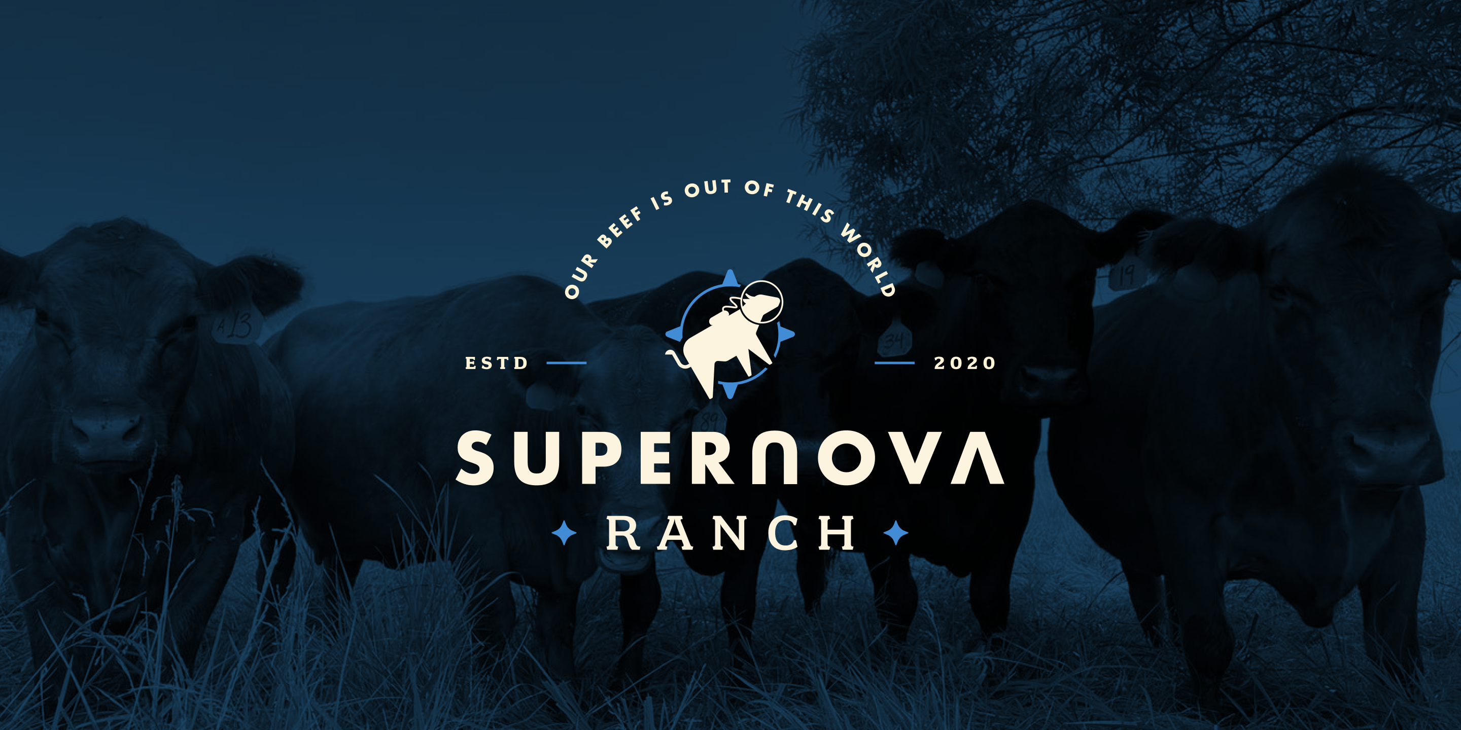
The Logo
The chosen logo is a dynamic mark combining a stylized tree—a universal symbol for growth, roots, and long-term stability—within a clean hexagonal boundary. The hexagon represents the organized, systemic nature of data and computation. The tree’s branches utilize crisp, modern lines, ensuring the entire mark feels current and sharp, while the logotype uses a modern, legible, and unpretentious font to maintain relevance and dependability.

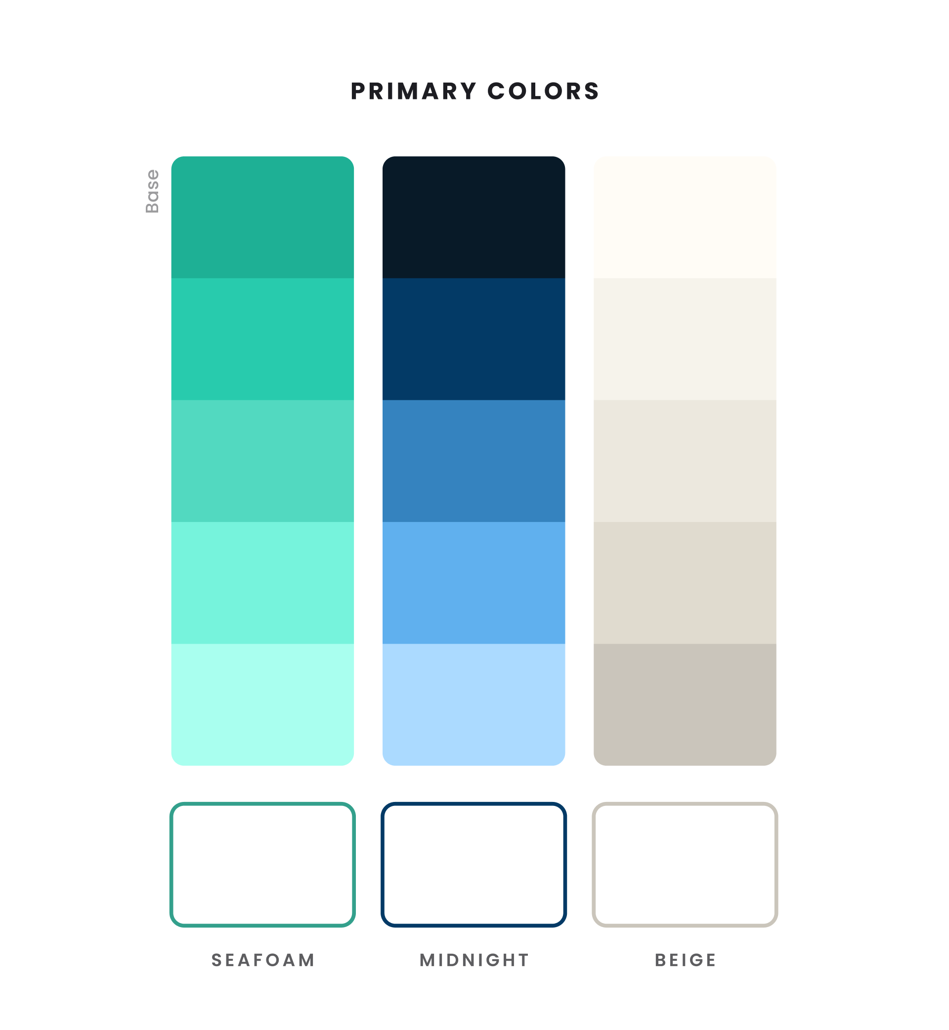
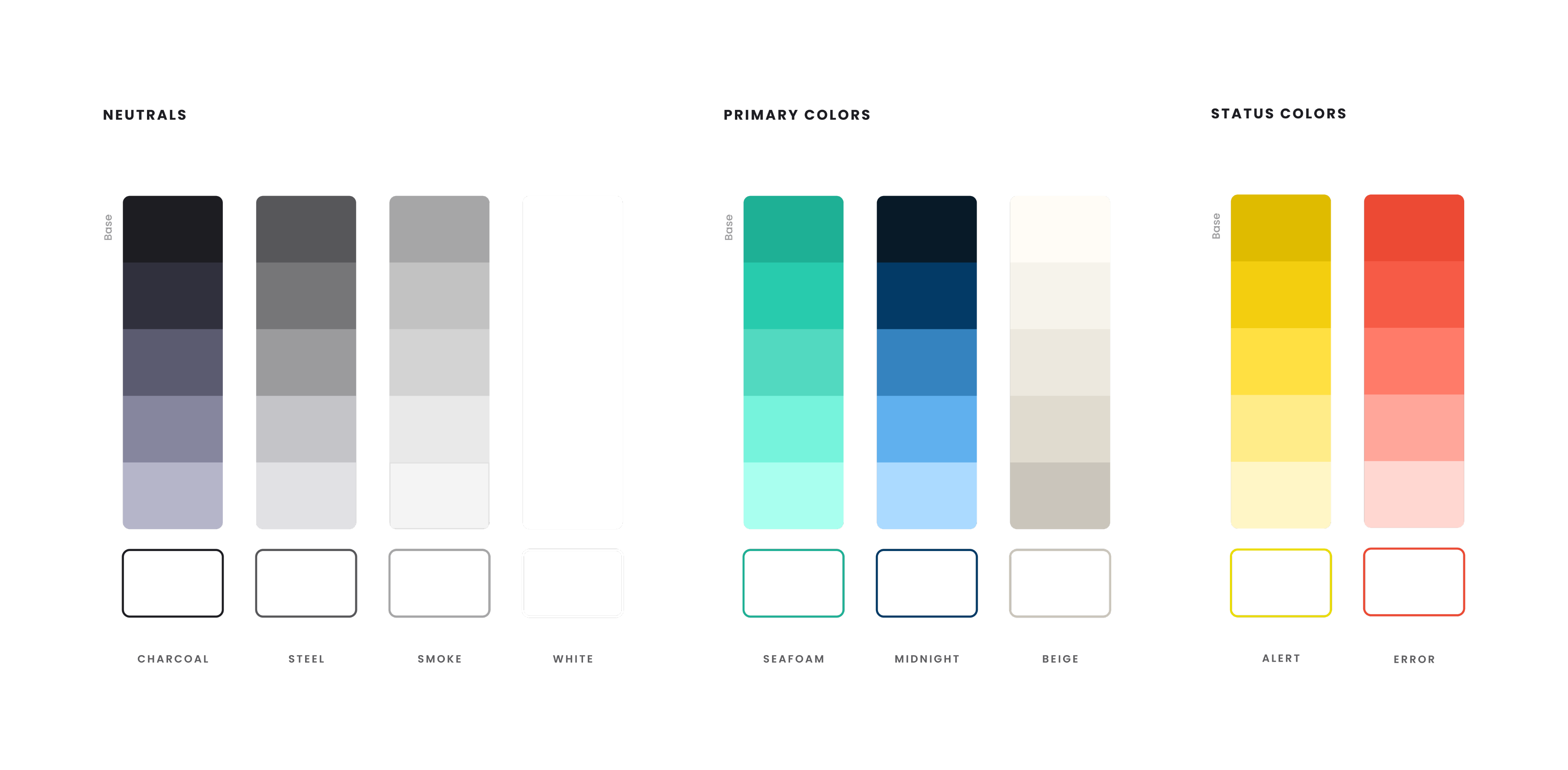
Color Palette
The color palette was meticulously crafted to ensure flexibility, accessibility, and trust.
Primary Colors: We established a clear hierarchy using HQ Green and HQ Blue. The Green symbolizes growth and positive financial performance, while the Blue conveys authority, stability, and professionalism. The soft beige acts as a grounded, warm background color, softening the digital experience.
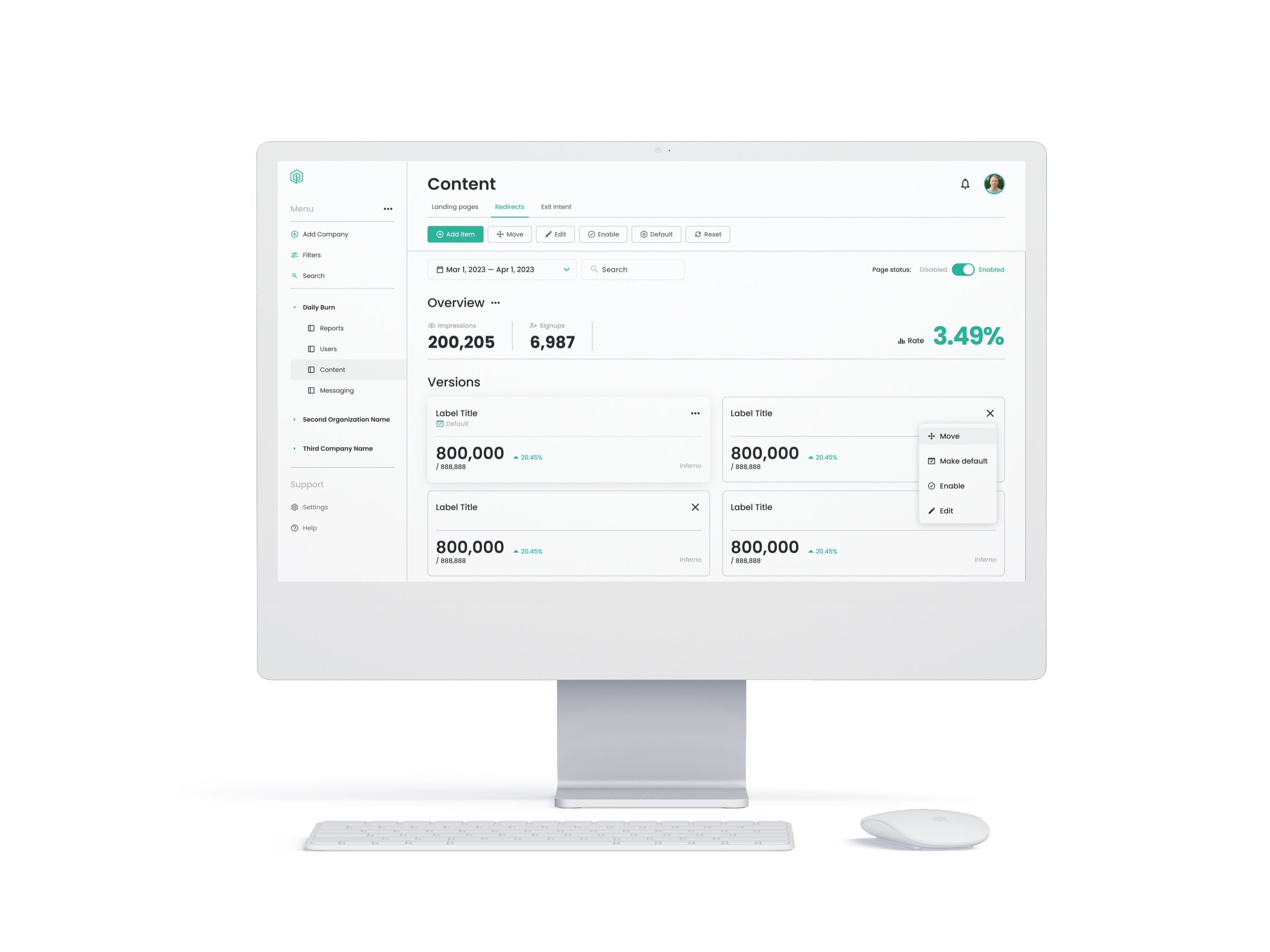
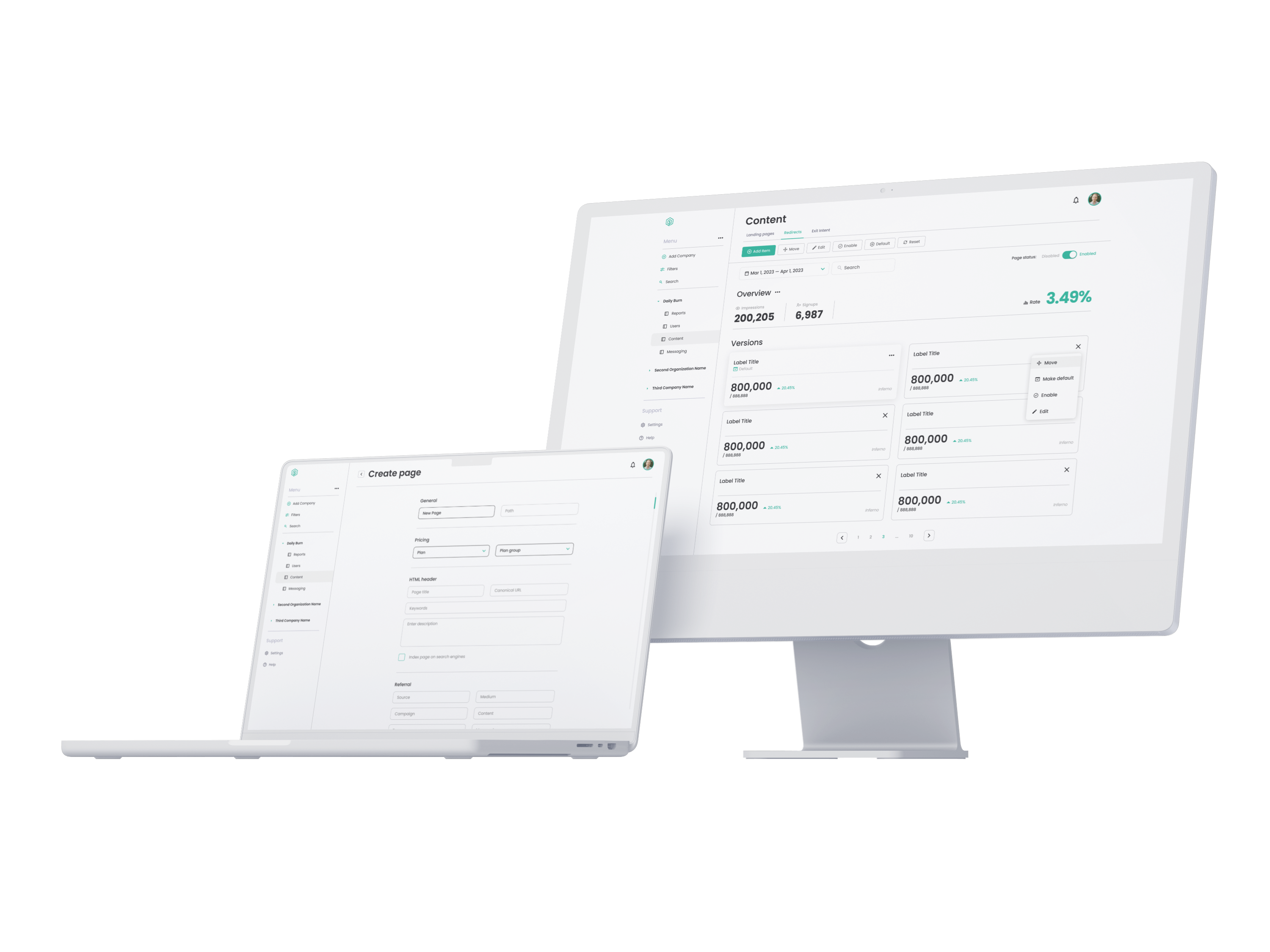
Design System
To provide the developer with a truly comprehensive go-by, we moved beyond core components to create a living design system that covered virtually every conceivable use case. The system was engineered to deliver that familiar, structured desktop feel while maintaining modern performance.
Cards
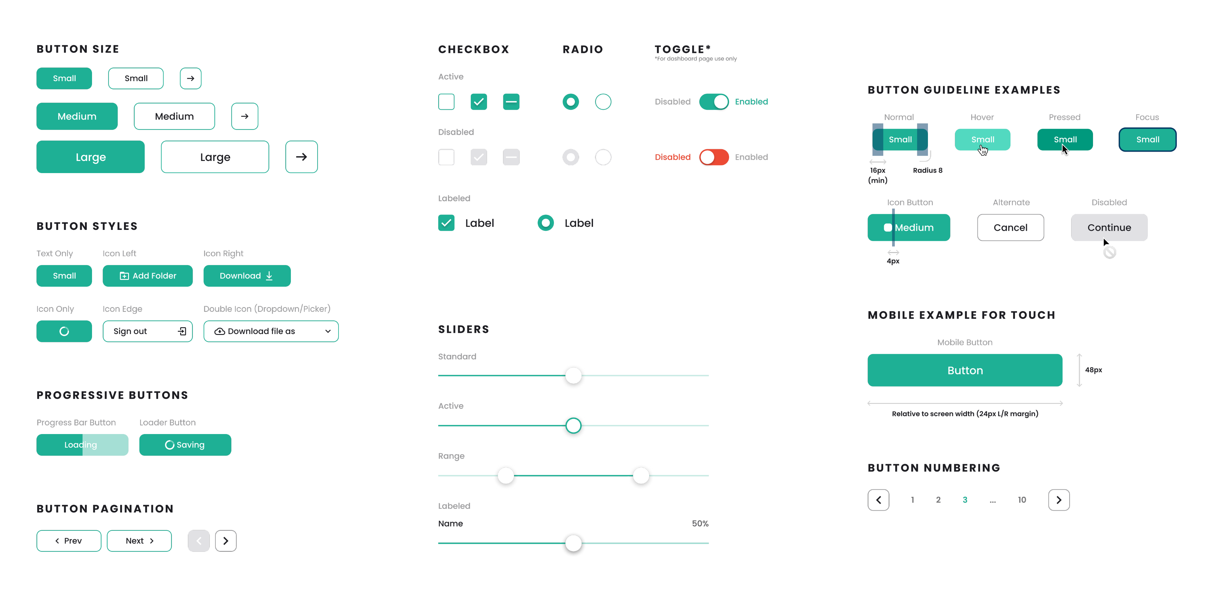
Controls
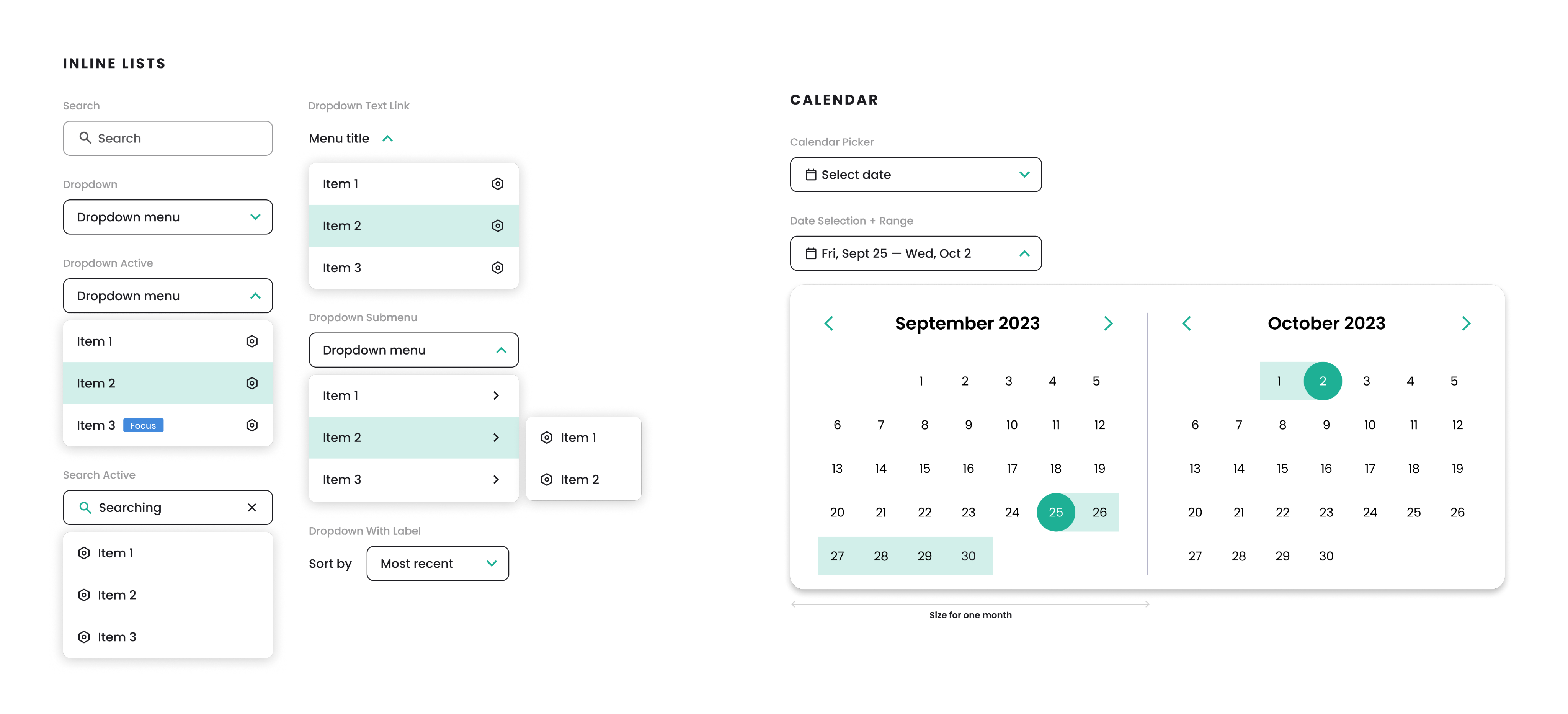
Data Input & Selection
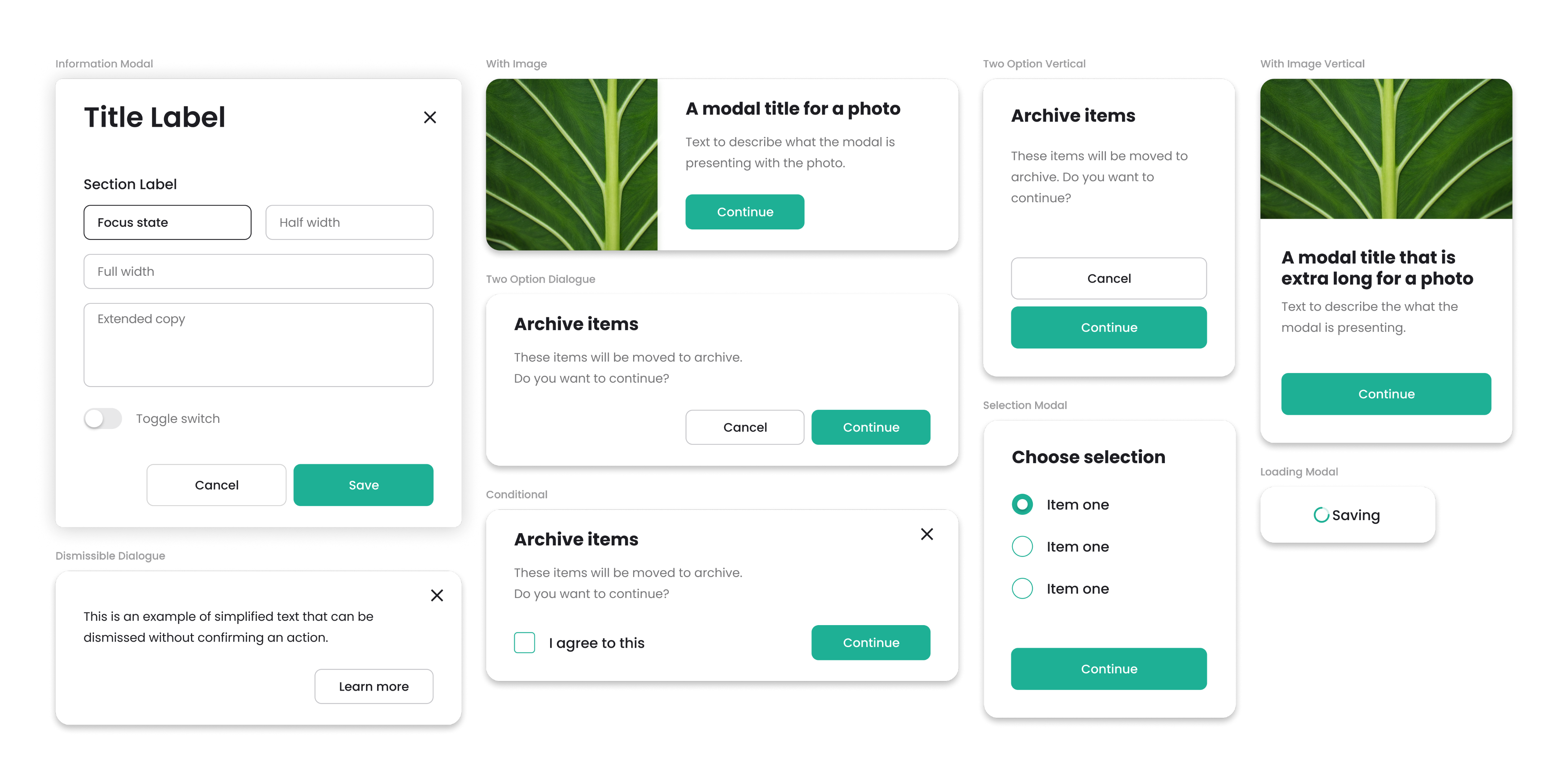
Modals
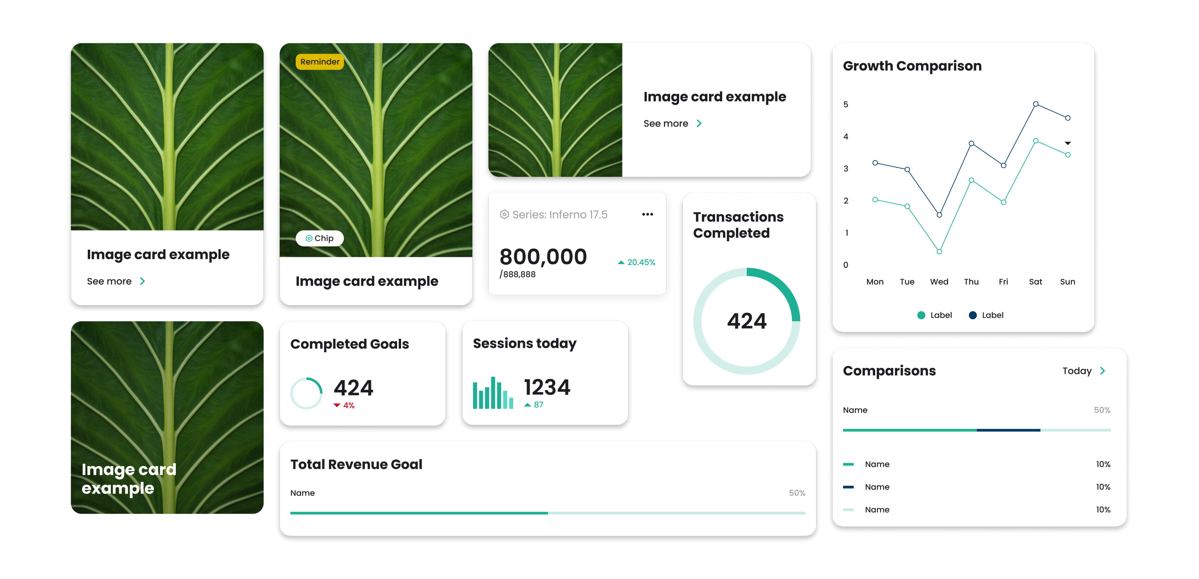
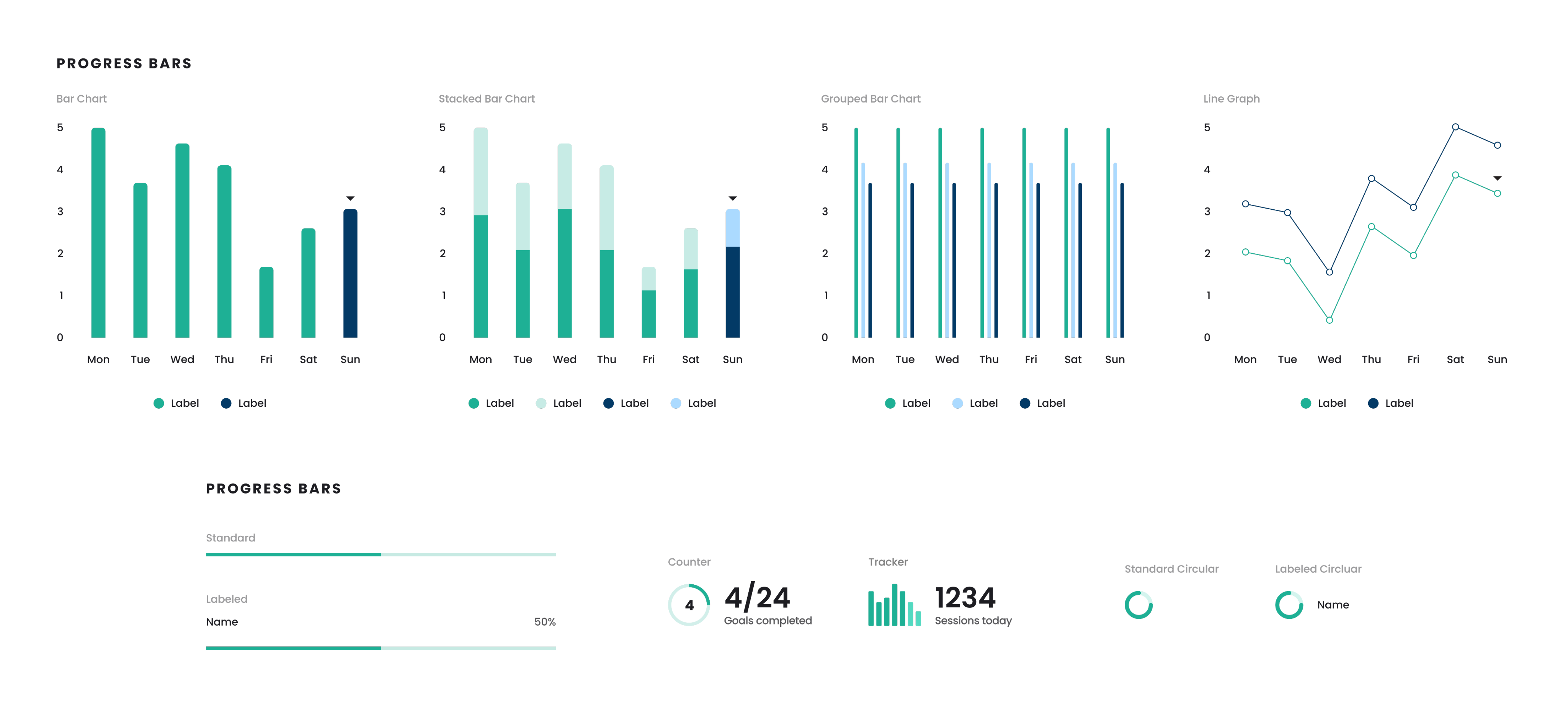
Data Visualization
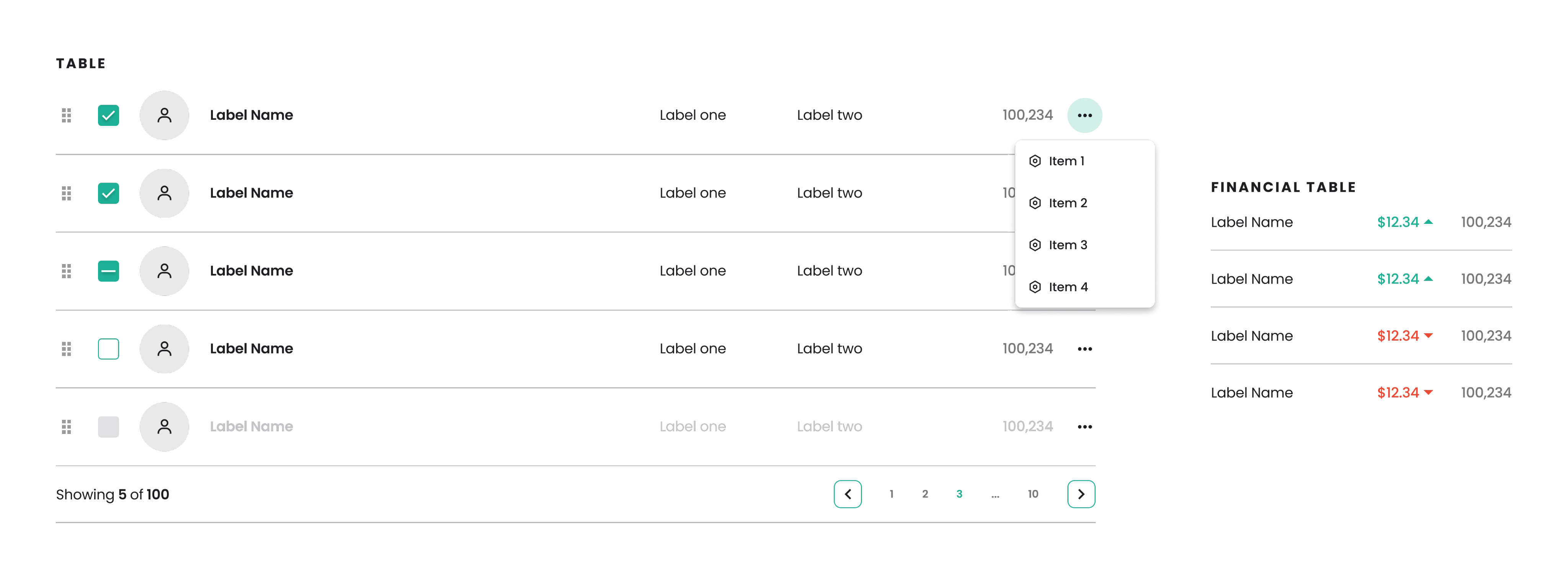
Tables
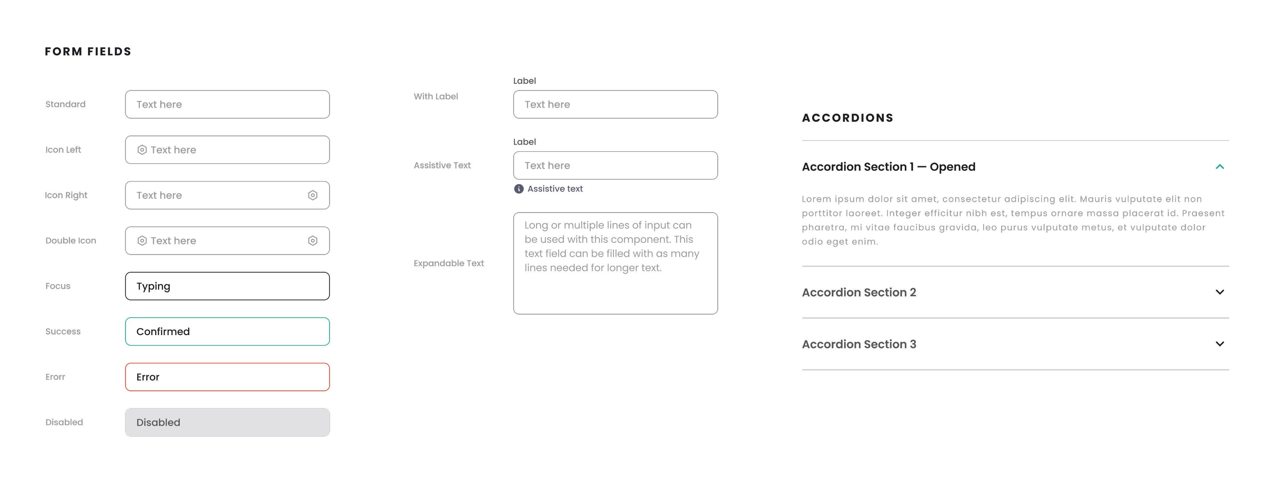
Form Fields
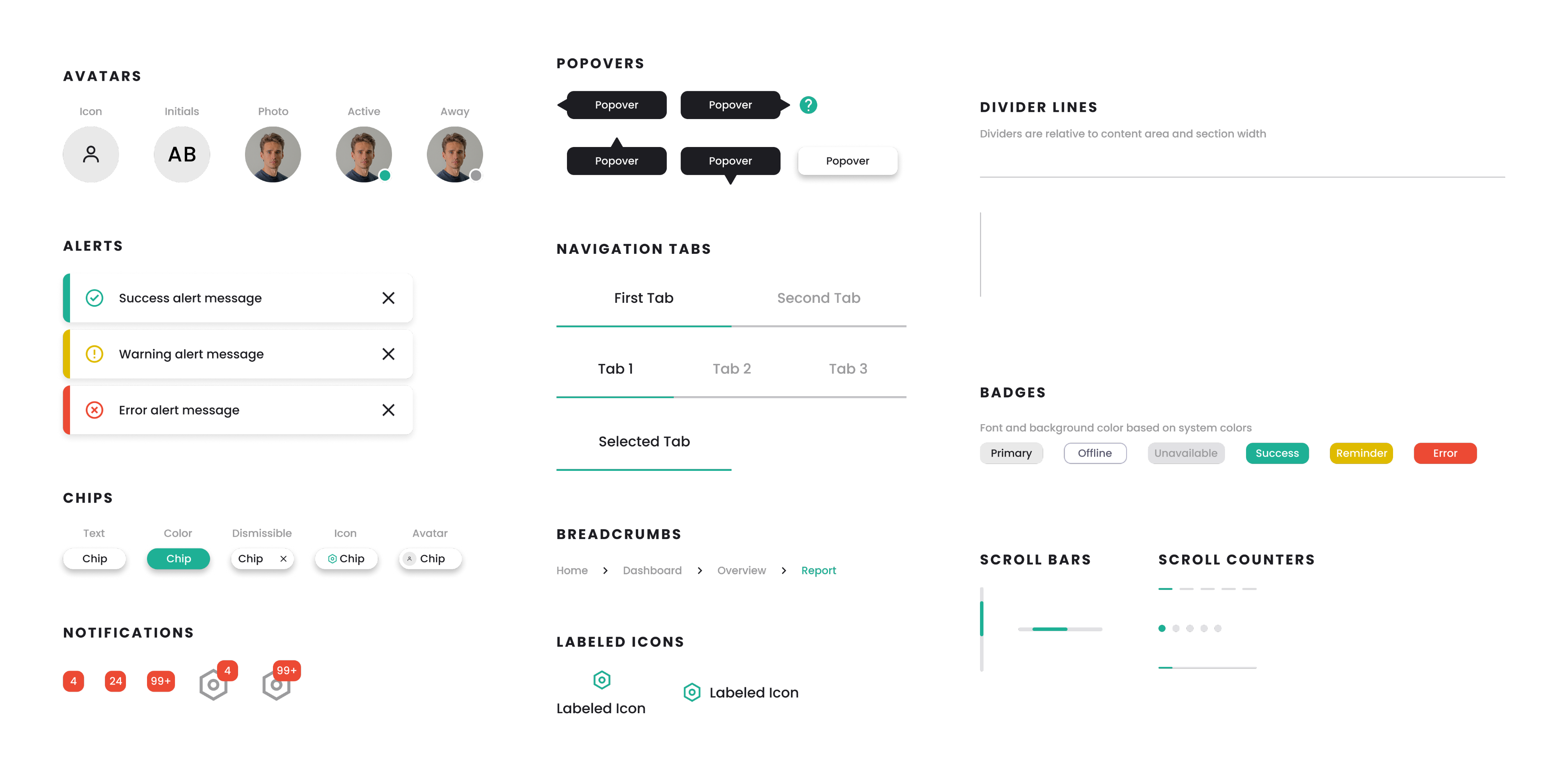
Visual Indicators
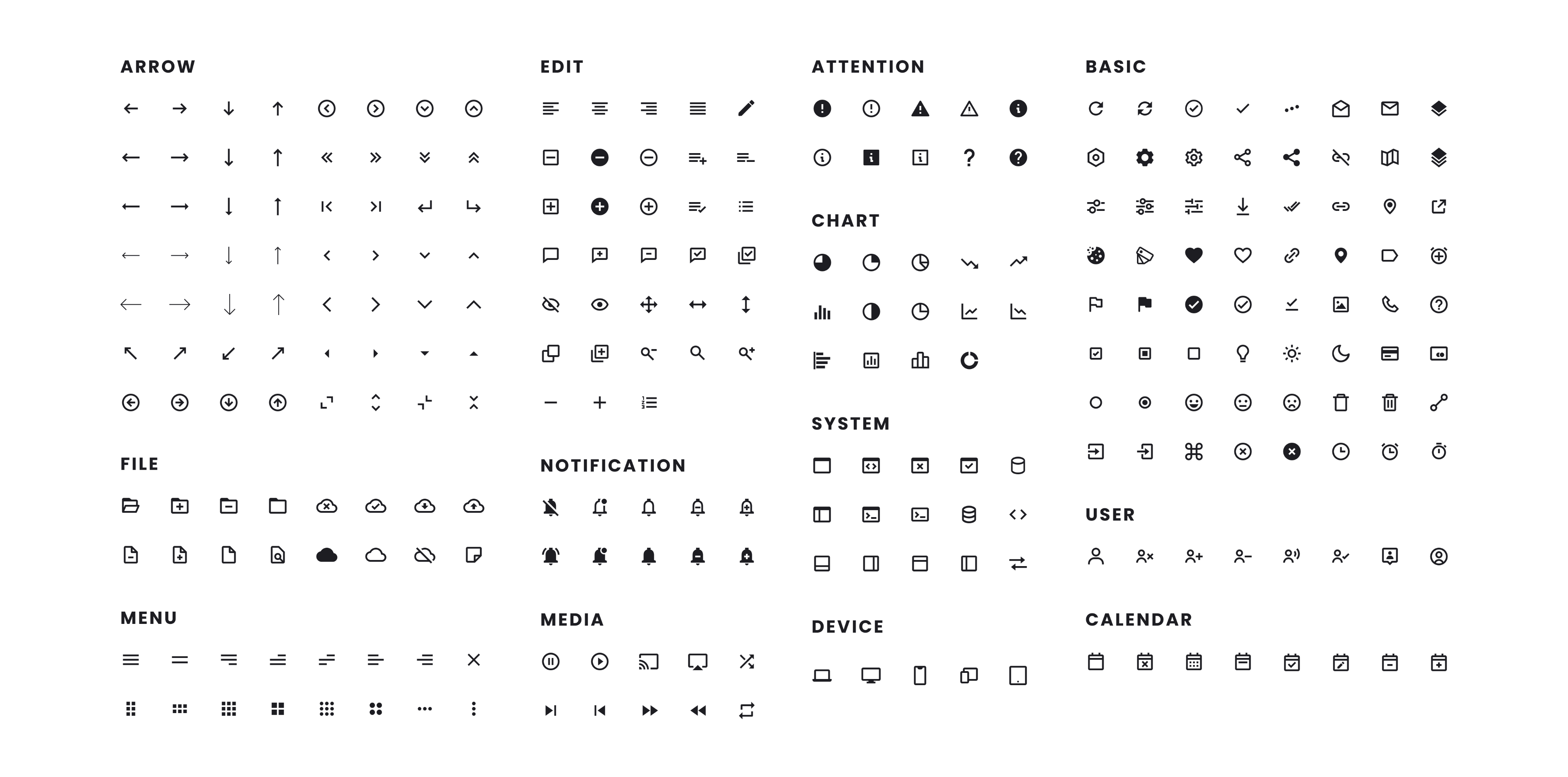
Iconography
Conclusion
By delivering a fully articulated brand and a UI system this thorough—from the smallest component to the broadest styles—we empowered the client to move straight into development. The resulting product is reliable, meets the specific demands for a classic Microsoft-like feel, and is intrinsically user-friendly and accessible. The client was extremely happy with the final brand system and the detailed go-by examples, giving them the confidence and foundation needed to launch Revenue HQ successfully.

Other Projects

Case Study
Revenue HQ
Building Trust Through Familiarity
A developer approached us with a clear objective for his digital product: to build user trust through familiarity. The financial web app required a complete visual identity and a design system for older desktop users who preferred older interface designs. The core challenge was blending the trusted, structured feel of legacy software with a modernized and accessible design. The resulting system feels trustworthy while adhering strictly to UX best practices and ADA guidelines. The high-contrast system successfully merges classic desktop familiarity with a modern identity.
Design
Cora Woodward
Justin Smith
Ideation
Our ideation process focused on blending traditional financial concepts with modern digital clarity. After exploring various sketches, including geometric lettermarks, house icons to represent “HQ” leaves to represent growth or simpler badge or logotype designs, the final concept merged growth and structure.
The Logo
The chosen logo combines a stylized tree, a universal symbol for growth and long-term stability, within a clean hexagonal boundary. The hexagon represents the organized, systemic nature of data and computation. The logotype was crafted using a highly legible and unpretentious font to communicate relevance and dependability.
Color Palette
The color palette was crafted to ensure flexibility, accessibility, and establish a feeling of trust. RHQ green serves as the foundation color of the brand symbolizing growth and positive financial performance. The blue compliments the green conveying authority, stability, and professionalism. The color system utilizes cool and warm neutrals and status colors to be flexible within any use-case.
Design System
To provide the developer with a truly comprehensive go-by, we designed a thorough and living design system. The system was engineered to deliver a familiar, structured desktop feel while maintaining modern performance.
Cards
Controls
Data Input & Selection
Modals
Data Visualization
Tables
Form Fields
Visual Indicators
Iconography
Conclusion
By delivering a fully articulated brand and a UI system this thorough—from the smallest component to the broadest styles—we empowered the client to move straight into development. The resulting product is reliable, meets the specific demands for a classic Microsoft-like feel, and is intrinsically user-friendly and accessible. The client was extremely happy with the final brand system and the detailed go-by examples, giving them the confidence and foundation needed to launch Revenue HQ successfully.

Other Projects

Case Study
Revenue HQ
Building Trust Through Familiarity
A developer approached us with a clear objective for his digital product: to build user trust through familiarity. The financial web app required a complete visual identity and a design system for older desktop users who preferred older interface designs. The core challenge was blending the trusted, structured feel of legacy software with a modernized and accessible design. The resulting system feels trustworthy while adhering strictly to UX best practices and ADA guidelines. The high-contrast system successfully merges classic desktop familiarity with a modern identity.
Design
Cora Woodward
Justin Smith
Ideation
Our ideation process focused on blending traditional financial concepts with modern digital clarity. After exploring various sketches, including geometric lettermarks, house icons to represent “HQ” leaves to represent growth or simpler badge or logotype designs, the final concept merged growth and structure.
The Logo
The chosen logo is a dynamic mark combining a stylized tree—a universal symbol for growth, roots, and long-term stability—within a clean hexagonal boundary. The hexagon represents the organized, systemic nature of data and computation. The tree’s branches utilize crisp, modern lines, ensuring the entire mark feels current and sharp, while the logotype uses a modern, legible, and unpretentious font to maintain relevance and dependability.
Color Palette
The color palette was meticulously crafted to ensure flexibility, accessibility, and trust:
- Primary Colors: We established a clear hierarchy using HQ Green and HQ Blue. The Green symbolizes growth and positive financial performance, while the Blue conveys authority, stability, and professionalism. The soft beige acts as a grounded, warm background color, softening the digital experience.
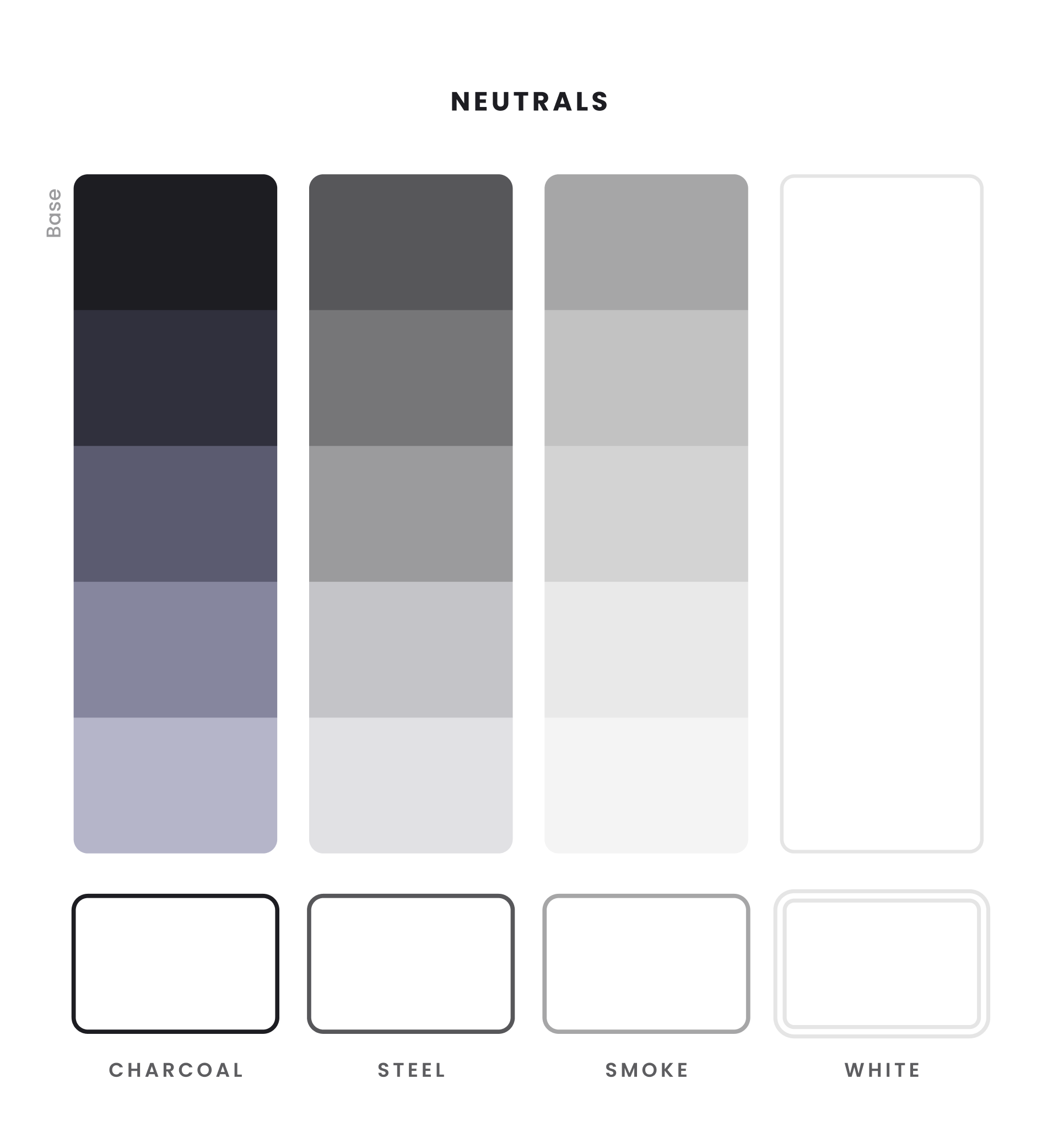
- Neutrals: The system employs a sophisticated range of grays, including Charcoal, Steel, and Smoke, providing necessary depth and high-contrast anchors for text and borders.
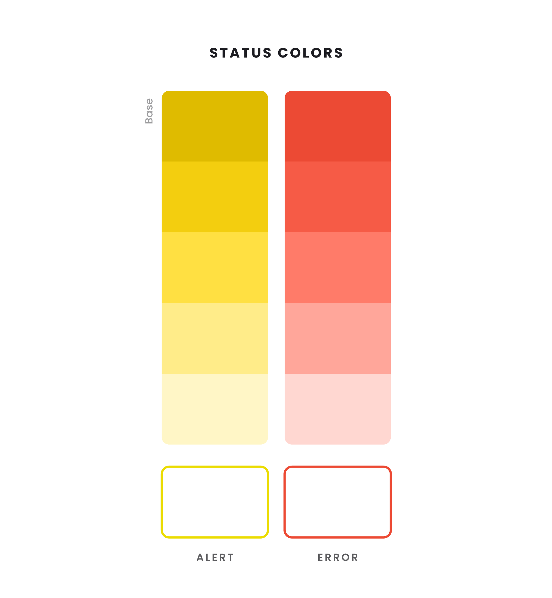
- Status Colors: Essential for immediate user feedback, high-visibility Yellow (Alert) and Red (Error) were selected for immediate warning and error states.
Crucially, we created five shades of every primary and neutral color. This deep color scale provides flexibility for various UI situations, such as light and dark mode application, hover states, and, most importantly, ensuring the required color contrast ratios were met across all states, guaranteeing full ADA compliance.
Design System
To provide the developer with a truly comprehensive go-by, we moved beyond core components to create a living design system that covered virtually every conceivable use case. The system was engineered to deliver that familiar, structured desktop feel while maintaining modern performance.
Cards
Controls
Data Input & Selection
Modals
Data Visualization
Tables
Form Fields
Visual Indicators
Iconography
Conclusion
By delivering a fully articulated brand and a UI system this thorough—from the smallest component to the broadest styles—we empowered the client to move straight into development. The resulting product is reliable, meets the specific demands for a classic Microsoft-like feel, and is intrinsically user-friendly and accessible. The client was extremely happy with the final brand system and the detailed go-by examples, giving them the confidence and foundation needed to launch Revenue HQ successfully.

Other Projects